Bliq
Design system, Mobile app, B2C SaaS, Branding
OVERVIEW
- The team: At Bliq, I was a solar product designer, and I collaborated with multiple stakeholders including a product designer, developers, a graphic designer and a commercial team.
- Role: Product design (UX/UI).
- Tools: Figma, Adobe Creative Suite, Microsoft Forms
THE CLIENT
Bliq specializes in energy management solutions, with a focus on home battery systems.
During my time at Bliq, I led the design of several major projects. One of my key contributions was developing the design system (UI library), which I worked on while simultaneously conducting research and redesigning the Bliq app - a platform for Bliq customers to monitor their Bliq battery control service. Additionally, I spearheaded a marketing research initiative that resulted in a successful rebranding of the company and in improvements in the Bliq website. I also took the lead in designing Bliq Qontrol, a SaaS platform used by Bliq administrators and installers to manage and optimize energy systems.
THE CHALLENGE
As the first UX/UI product designer at Bliq, I faced two primary challenges:
- Leading the design of multiple Bliq software platforms
- Conducting research to bring user experience to the forefront of Bliq’s design process
- Shifting the company’s mindset towards a UX/UI-driven, user-centric approach
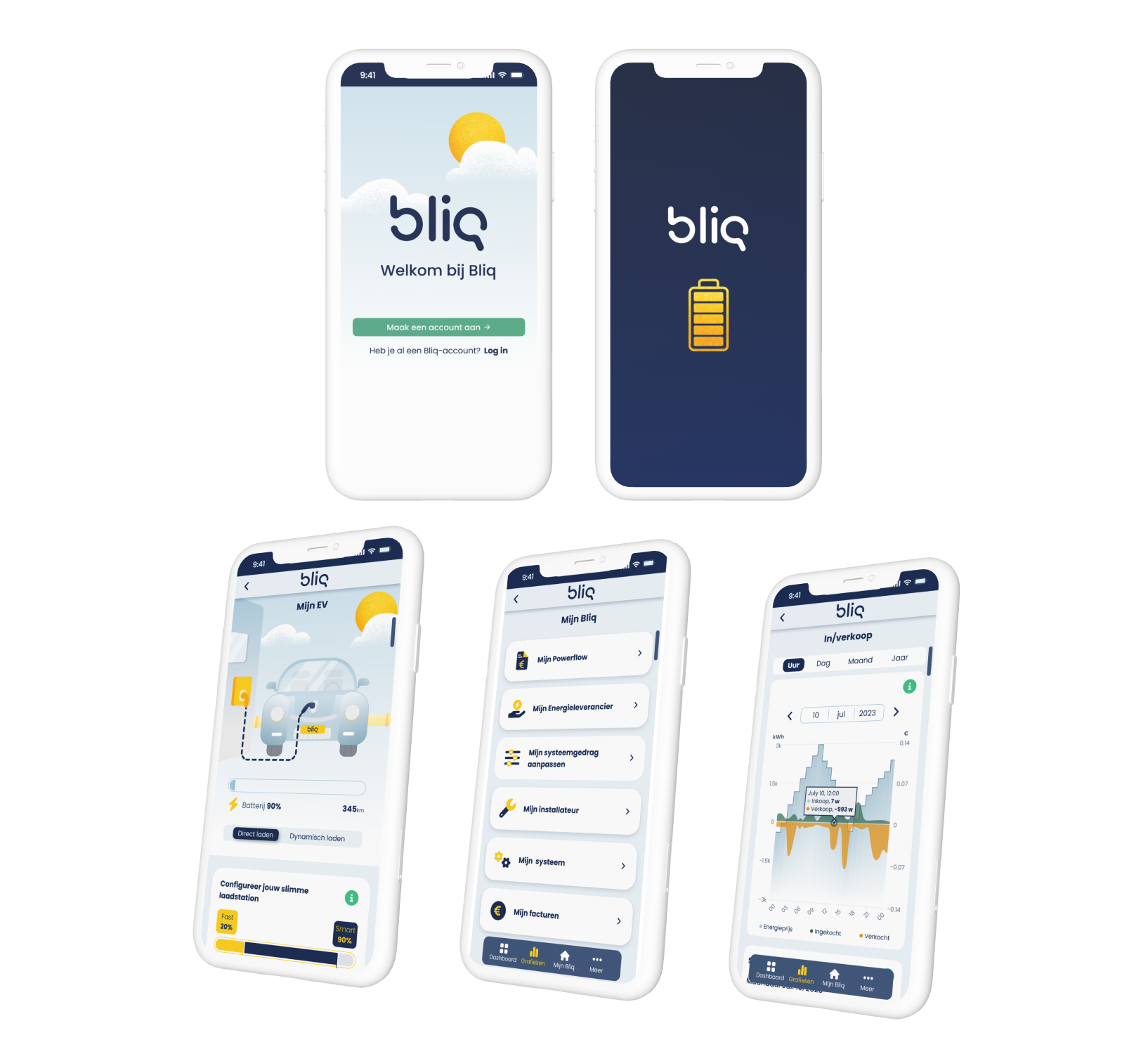
Following I will briefly detail the working process on every platform separately.
Bliq app
One of the first projects I was asked to do is to re-design the Bliq app. The strategy to approach this task was by starting an extensive user research and then proceed with defining problems, ideating and iterating, wireframing, testing and ending with high-fedility design.
RESEARCH
The primary research method used was interviews, during which I spoke with approximately 20 individuals. The participants included current users of the app, external Bliq installers, and individuals unfamiliar with Bliq, experiencing the app for the first time. Additionally, I interviewed several Bliq employees who regularly interact with customers to gain insights into the most frequent issues raised by users.
The goal of these conversations was to gain a comprehensive understanding of the key problems that needed to be addressed in the redesign.
Below is a summary of the main issues identified through the research:
- The app does not clearly communicate the cost savings customers achieve by using Bliq.
- The dashboard wheel is unclear and often not functioning properly.
- The time navigation for graphs is not user-friendly, making it difficult for users to intuitively select specific days.
- The app's illustrations take up too much space and give a childish impression, lacking clarity and functionality.
- The installer page is not functioning or updated properly.
- The app does not provide a clear overview of system components and their activity.
- There is no well-organized Q&A section within the app.
- Users expressed a need for an easier way to contact Bliq directly through the app.
- These, among other issues, were highlighted during the research.
Next, I will focus on one problem and elaborate over the design solution.
Homepage Dashboard and Clarifying Cost Savings
PROBLEM
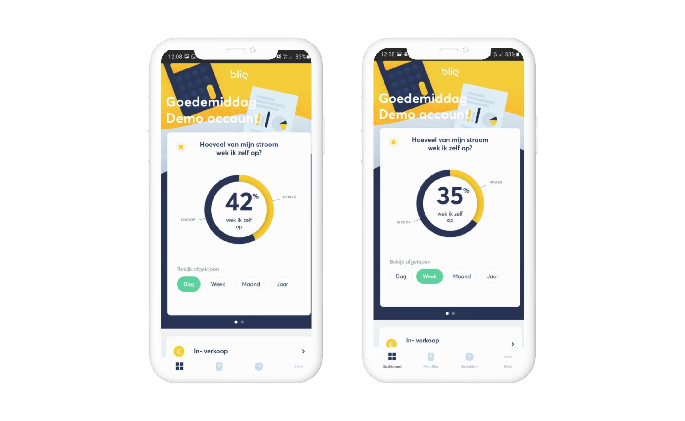
All 20 interviewees indicated that the Bliq app's dashboard was unclear and did not effectively communicate how much cost savings were being achieved—information that customers considered the most important feature to have on the homepage.
The previous design featured a wheel displaying the amount of energy produced and consumed, but it lacked clear information on the exact cost savings.
IDEATION
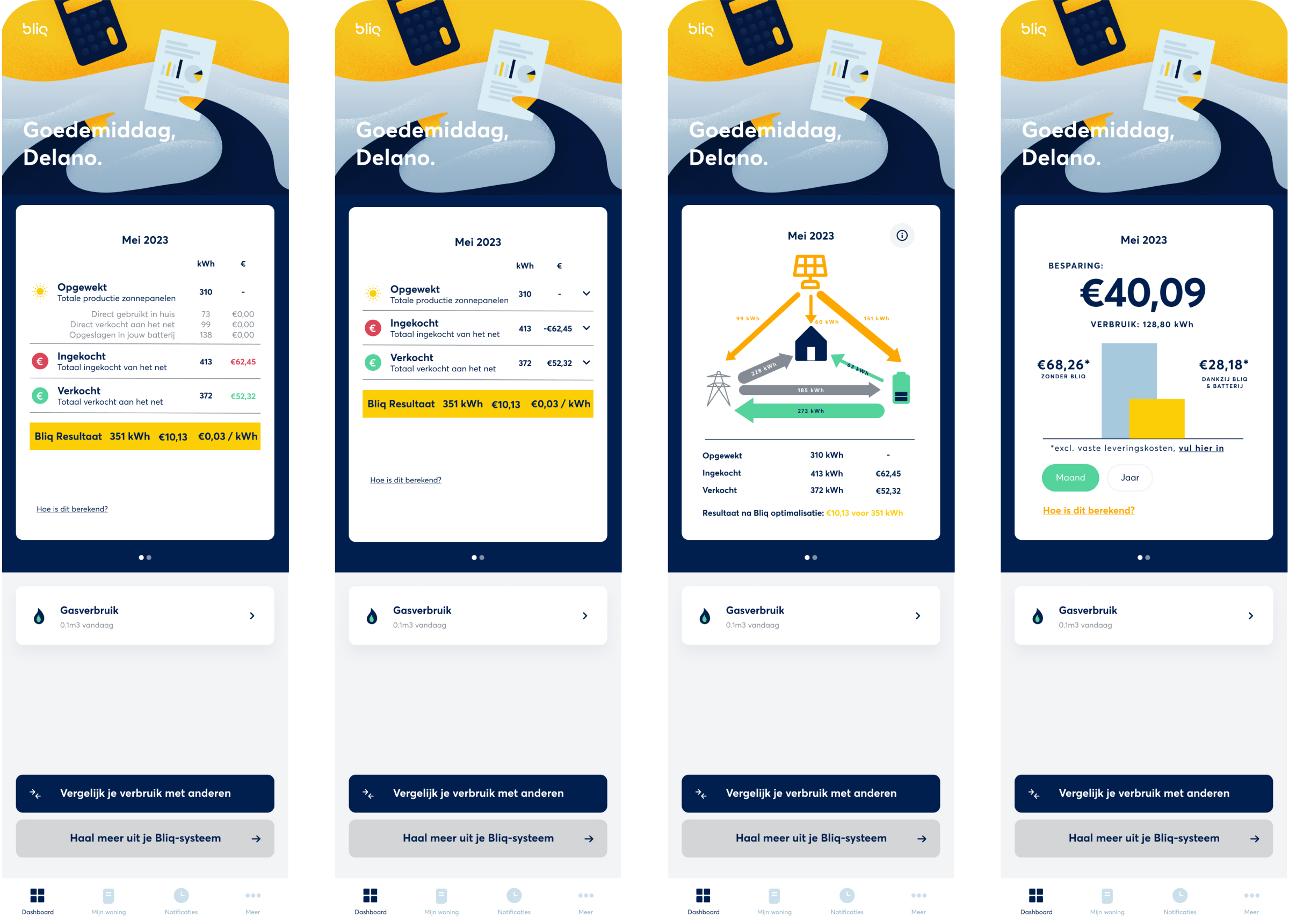
I developed several mock-ups with proposed solutions and tested them with the 20 interviewees. During these sessions, I asked targeted questions to understand which information users prioritize on the homepage and which display methods are most effective for presenting this content.
In the mock-ups, I included cost details alongside energy consumption and production data. I also incorporated functional illustrations that clarified the system components and their operations. Additionally, one proposal featured a comparison of energy costs with and without Bliq to give users a clearer sense of the savings.
SOLUTION
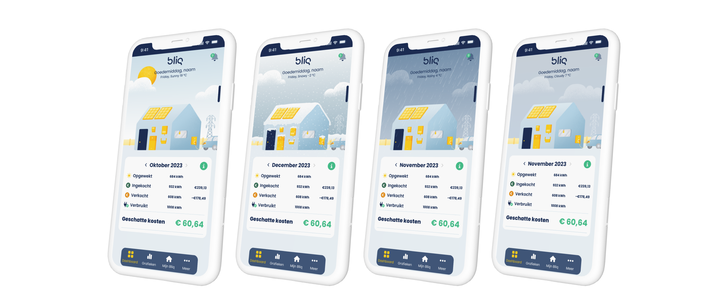
Based on user feedback, the majority of app users found the first design, which displayed exact energy consumption and production in both EUR and kWh, to be the clearest and most engaging. As a result, the final design incorporated a dashboard featuring these precise figures including taxes and additional costs.
Additionally, users expressed a strong preference for a more visual representation of their system's operations and status. To address this, the dashboard included an illustration of a house with all devices connected to the Bliq system. The color of each system component in the illustration indicates its status—whether it is connected, disconnected, functioning, or malfunctioning.
Moreover, users wanted to understand how their system operates in relation to real-time weather conditions, which influence energy dynamics and tariffs. To accommodate this, the illustration also displays live weather updates, providing users with a comprehensive overview of their system’s performance.

Marketting research & Branding
The main question in this research was “How to sell Bliq?”. The goal was to improve the story told to sell Bliq in order to reach more potential customers ad early adapters.
RESEARCH
To investigate this, I interviewd 10 people who are either interested in Bliq but are not cubscribed customers yet as well as other people who didn’t know about the service. Some of which were interested in technology and others who are not tech-savvy or knowledgable about the subject. I showed the customers the Bliq website and asked them questions while navigating it.
FINDINGS
Following are excerpts from the results:
- The website does not explian the Bliq proberly. It contains long texts, yet the service remains unclear.
- The website has a boring and plain style and needs a clear appealing visual identity that suits the Bliq concept.
- The calculator in the Bliq website homepage is not correct and not easy to user.
- There is not clear contact details in the website, and people would like more personal way of communication
RESULTS
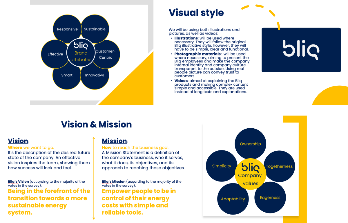
This research resulted in creating Bliq SWOT analysis (strengths weaknesses opportunities and threats), company values, mission and vision, brand attributes, visual identity.
Bliq Design System
Over the past two years, one of the most significant projects at Bliq was the creation of a comprehensive design system. Prior to this, Bliq's designs lacked a unified system or clear guidelines, which resulted in inconsistencies across different platforms. The absence of a design system not only disrupted visual cohesion but also led to inefficiencies, with developers and designers frequently starting from scratch for each project. Additionally, the ongoing changes in design roles contributed to gaps and inconsistencies that needed to be addressed.
The development of the design system occurred alongside major projects, including the redesign of the Bliq app, improvements to the Bliq website interface, and a redesign of Bliq Qontrol (a SaaS platform for Bliq administrators and installers).
PROCESS OVERVIEW
The design system was initially informed by marketing research, followed by usability and desirability testing to ensure that the components were clear, functional, and visually appealing to users.
Key elements of the process included finalizing the design of various components and creating detailed documentation to guide the use of these elements across platforms.
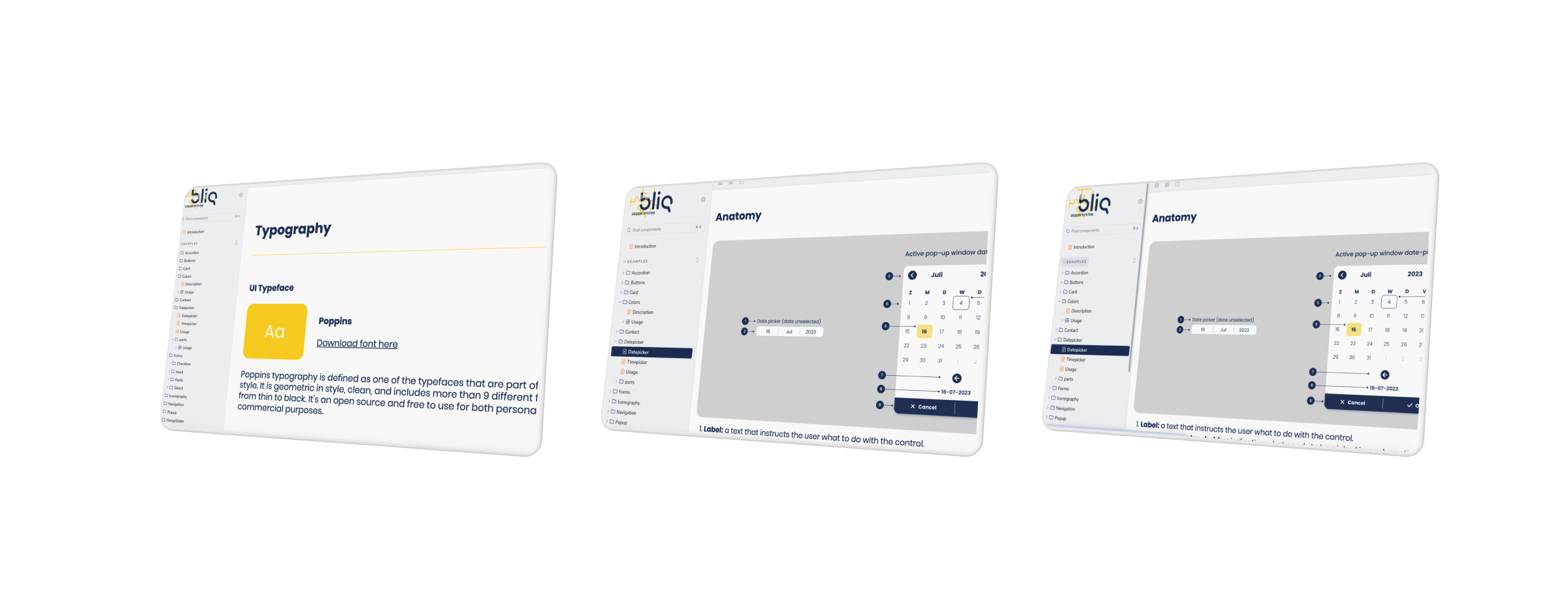
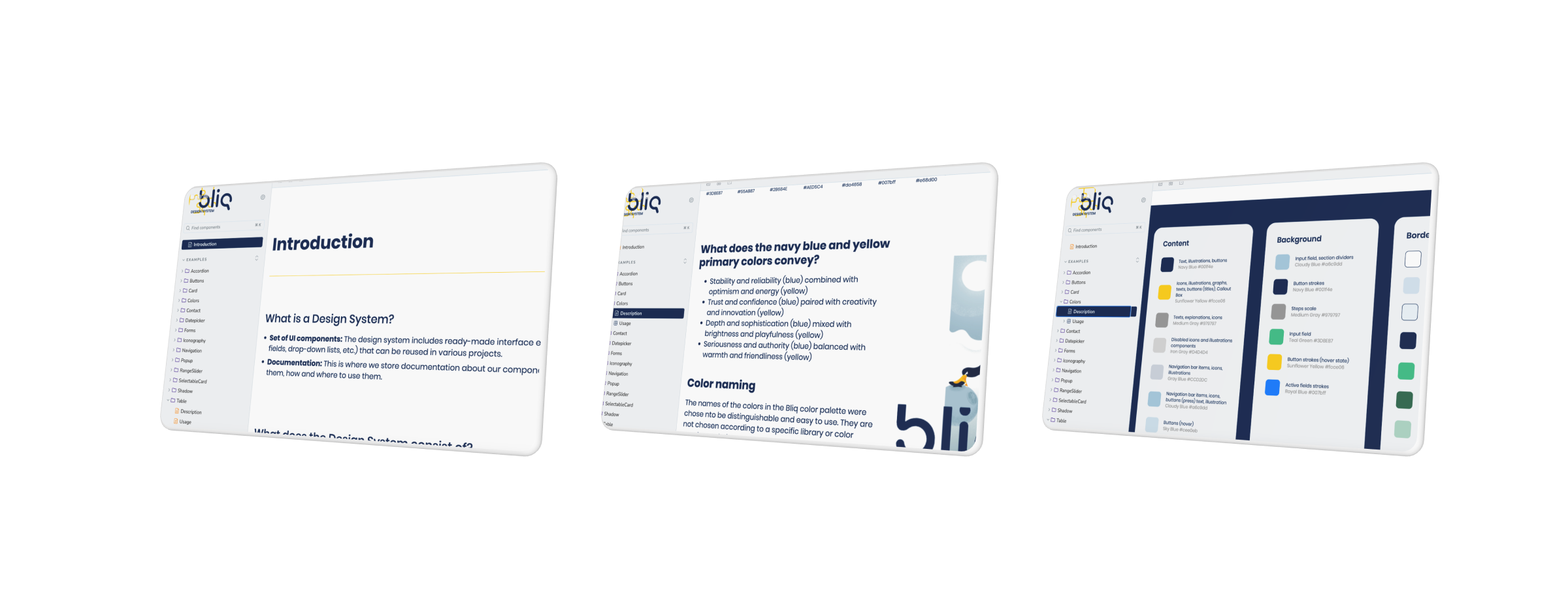
I began by defining the color palette and font styles. The color palette remained close to the original Bliq branding, while the font was carefully selected to align with Bliq's concept, remain visually appealing, and minimize costs, which was crucial for a startup.
Below are key excerpts from the Bliq design system.
Qontrol
Click here for the casestudy description.
