IBIS Power
Designing desktop dashboard
OVERVIEW
- The team: I worked on this project together with my Maria-Silvia Savulescu
- Role: UX/UI research and design
- Duration: circa 120 hours (part-time)
- Tools: Figma, Google Forms, Useberry, Maze, Notion, Slack, Zoom, Google Analytics, Adobe Photoshop, VEED.IO, Youtube
THE CLIENT
IBIS Power is a start-up company based in Eindhoven. It produces a hardware called PowerNEST - a wind & solar system is designed for medium- and high-rise buildings to capture more energy than a traditional solar set-up.
THE CHALLENGE
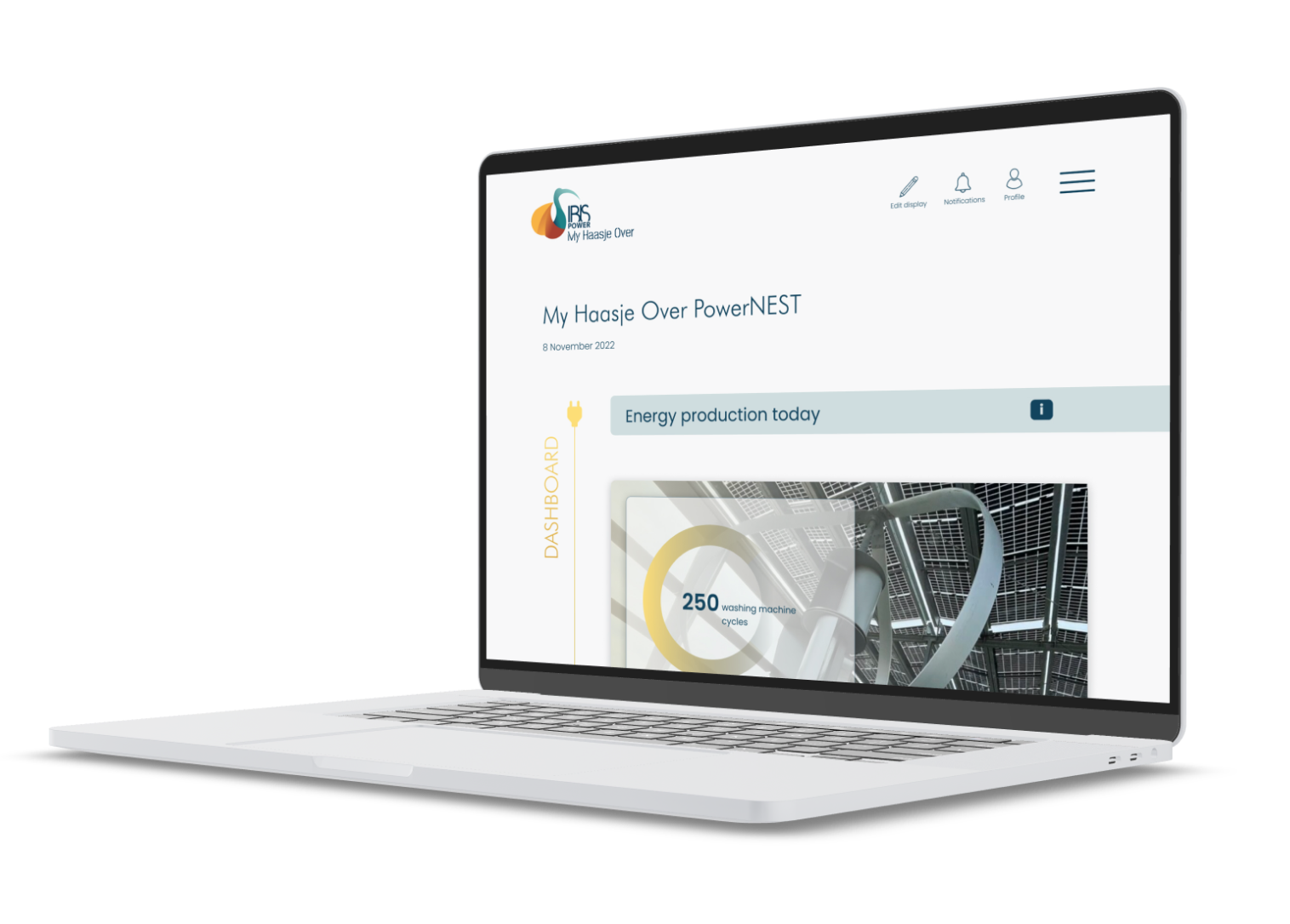
We were asked to design a digital product that allows IBISPower's customers to track the energy production of their PowerNEST.
RESEARCH
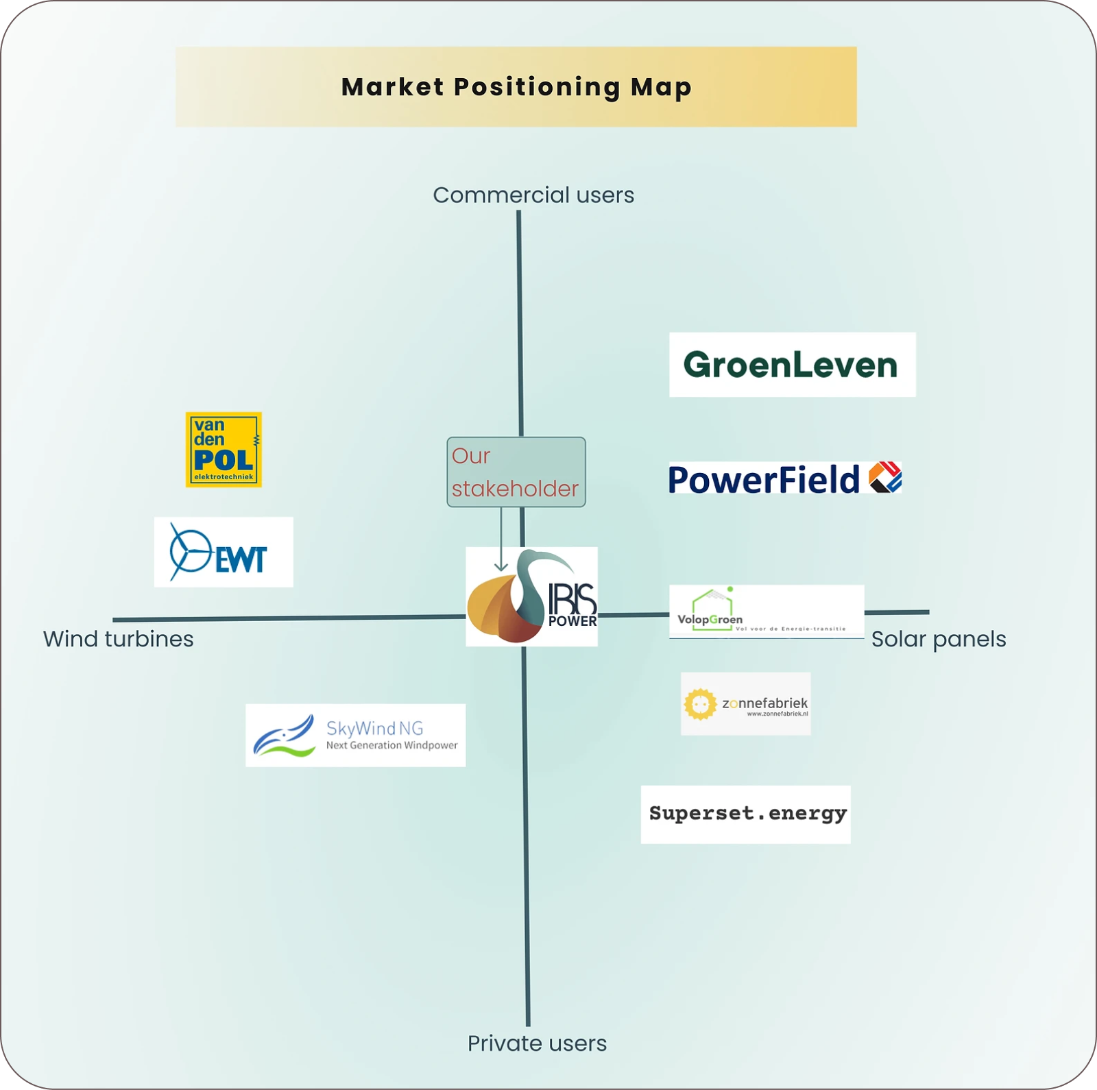
Our research started with the competitive business analysis, through which we found out that the product of IBIS Power is quite unique and with no direct competitors, at least in the Dutch market.
We decided to skip surveys and focus on interviews that can allow us
to dig deeper. We conducted 12 interviews with different types of
users, including customers of IBIS Power, people who have solar panels
and track their energy production, people who don't track their energy
production, and others who don't have a renewable energy devices.
By interviewing non-users (or potential users), we used speculative
research approaches which could eventually help us envision what such
a digital product could look like.
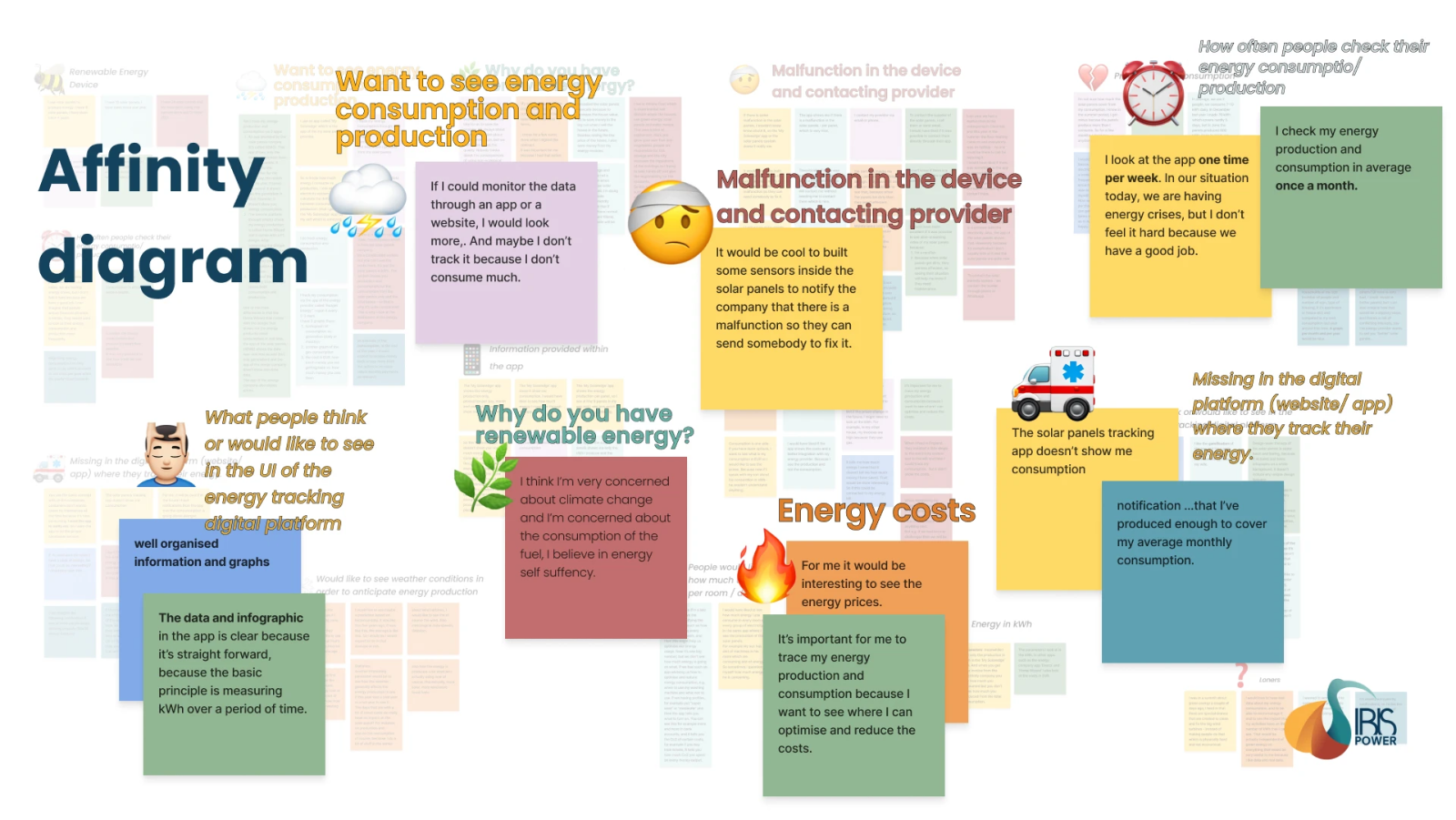
I usually look at the kWh (not at the EUR) because I feel this makes me have more control.
I want to be able to track the impact of energy-saving attempts if I want to lower costs / be more green, and to estimate how much I’m supposed to pay in the future.
It’s important for me to trace my energy production and consumption because I want to see where I can optimize and reduce the costs.
It would be interesting for me to see how much CO2 emissions the PowerNEST reduced compared to the average CO2 footprint in the Netherlands.
When I get my bill from the energy company, I look at how much I spent in EUR, kWh is abstract to me. But if the prices change in the future, I might need to look at the kWh.
SO WHAT DO USERS NEED?
IBIS Power customers need a way to monitor the performance of the PowerNEST because the lack of data leaves them with open questions and inaccurate assumptions about the functionality and performance of the product.
USER PERSONA
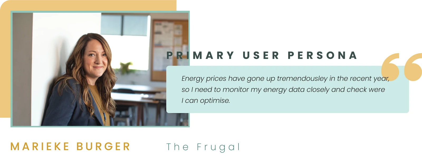
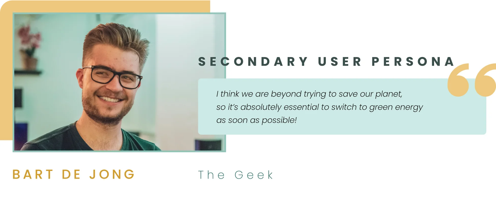
Based on the interviews, we realized that there are 2 types of potential users for IBIS Power dashboard; The first is the average user who is frugal, they would want to see data in an accessible way, whereas the second is the geek type who is eager to see as much data as possible.
SOLUTION ARCHITECTURE
From the beginning, we decided to keep the homepage dashboard minimal. The logic is to have all the last 24 hours data on the homepage and all the rest and data history in another page titled "My energy data". We used the card sorting on Maze research method which helped us in organizing all the categories that we wanted to include.
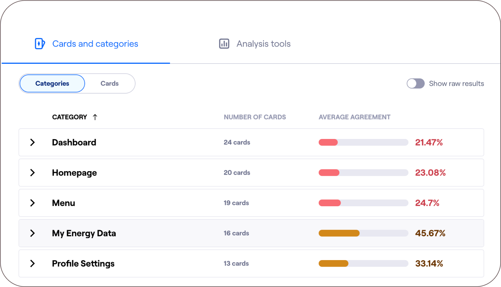
We iterated the information architechture several time, following the card-sorting but also in every testing phase, following is the final version of the site map which we came to after the high-fidelity testing:
MID-FIDELITY PROTOTYPES & USABILITY TESTING
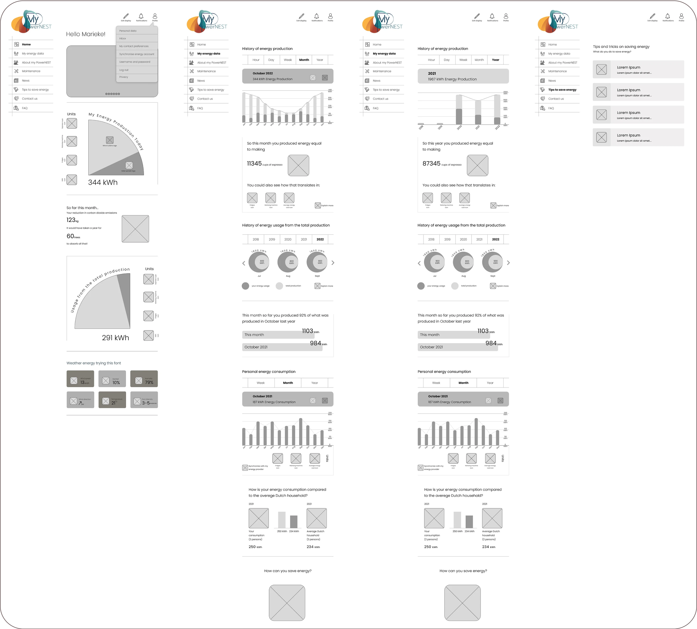
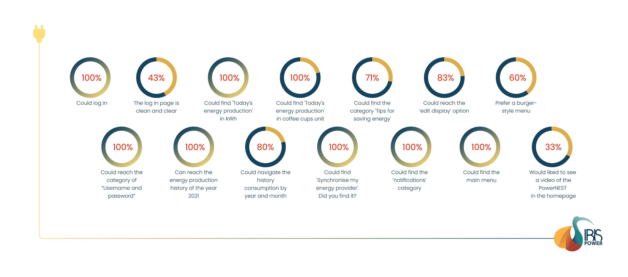
We were generally happy with the mid-fidelity usability testing result. However, we decided to change a few things including making a burger menu, dropping out the idea of the video on the homepage, as well as minimizing the drop-down main menu and profile menu. In addition, we decided to add a footer with a clear site-map.
GAMIFICATION AND SIMPLIFYING THE COMPLEX
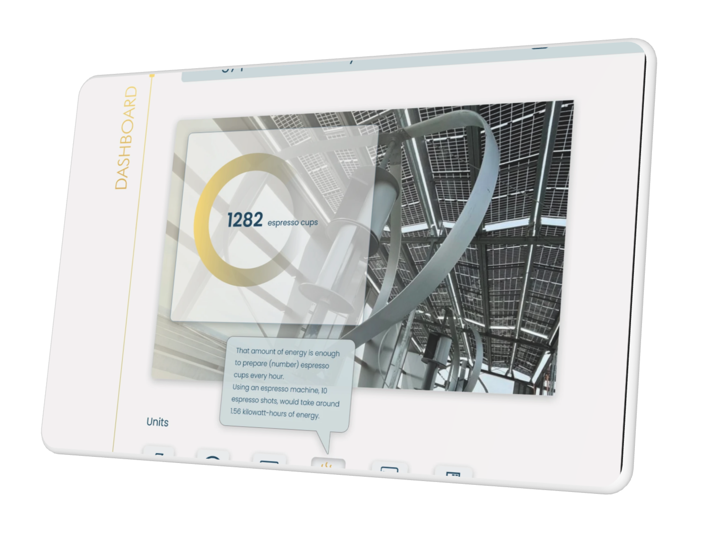
During the research, we realized that the majority of users are average people who don't understand complex energy data and units and how that translates into costs. So we decided to address this issue with gamification - that is, to suggest options to see how the energy production amount is quantifiable with tangible daily activities such as the number of washing machine cycles or espresso coffee cups. During the testing, we realized that this feature made the design and content and enjoyable.
VISUAL ANALYSIS AND MOODBOARD
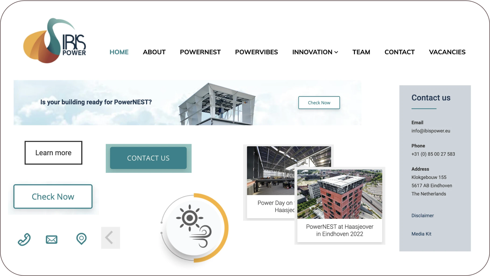
Since this dashboard will be a branch of the IBIS Power website, we needed to follow the same style of their existing website. So we did a visual analysis, then we came with a moodboard and brand attributed for this dashboard.

HIGH-FIDELITY PROTOTYPE & DESIRABILITY TESTING
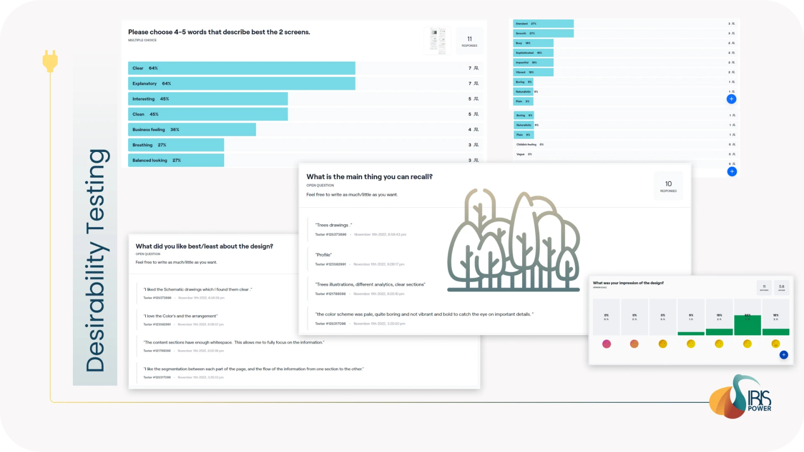
We created brand attributes based on the user research, we wanted to create a vibrant and motivating atmosphere which is simultaneously personal and customisable.

In the desirability evaluation, people said that the design looks clear, clean, and that it gives a business feeling. The most memorable visual feature was the trees. One person mentioned that the colors are pale and boring, however, we needed to follow the color palette of the IBIS Power website.
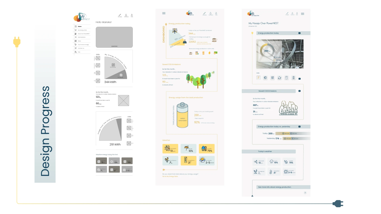
And this is the design progress and how we iterated throughout the process after user testing and various validations with the client.
Learnings
CONCLUSIONS
Good and swift communication and regular validations with the client can help to create a design which represents the identity of the company properly. The card-sorting and usability test help in improving the information architecture and the MVP Speculative research is an excellent way to envision how the product can be functional and desirable
WHAT'S NEXT?
- Responsiveness
- Finalize the design and create the rest of the screens
- Check the option for feeding the dashboard with energy consumption and not only production - a feature which is technically challenging due to privacy reasons.
- Move it forward to development
Feedback
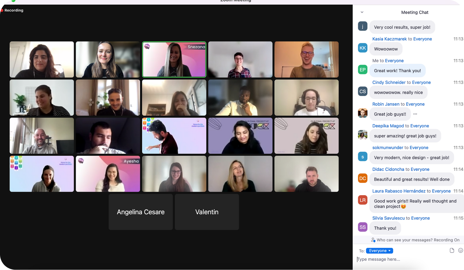
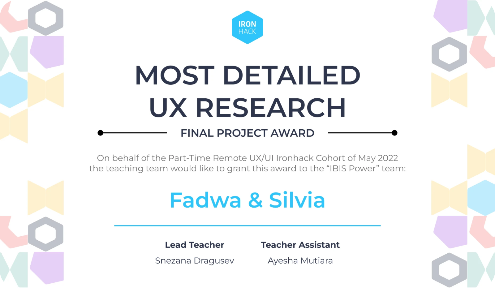
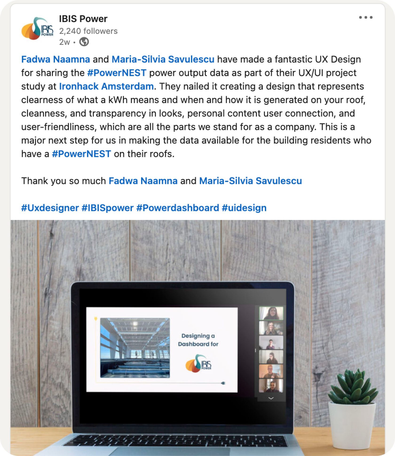
Following the presentation of the project, we received very good feedback from the client, the bootcamp mentors as well as from our colleagues. The project was chosen as the best elaborate UX research in the framework of the bootcamp.
