mOOv: Tracking your fitness
Designing native iOS fitness app
OVERVIEW
- The team: I worked on this project together with my colleague Jacob Champion (team members — 2 people in total).
- Role: UX/UI design and research.
- Duration: circa 52 hours (part-time)
- Tools: Figma, Google Forms, Notion, Slack, Zoom, Adobe Photoshop, VEED.IO, Youtube
THE CLIENT
The National Wellness Institute is an organization was founded in 1977 with the mission of providing health promotion and wellness professionals unparalleled resources and services that fuel professional and personal growth. They offer technological frameworks and tools that can help people to achieve their wellness goals live a healthier life.. The NWI wants designers to re-imagine how people can adopt and maintain a routine that enhances their wellbeing.
THE CHALLENGE
In this challenge, we worked on designing a native iOS app for tracking physical activity. Because of the massive competition in the market, our goal is to design a platform with unique brand features that distinguish it from the its competitors.
RESEARCH
To tackle this challenge, we started out design journey with a secondary research through which we aimed at understanding the market of fitness apps. We found out that the fitness apps market size grew significantly especially during the Covid-19 pandemic and lockdowns which aided the transition from physical studios to virtual fitness. The market is still expected to grow at almost 17% growth rate during the next 8 years.

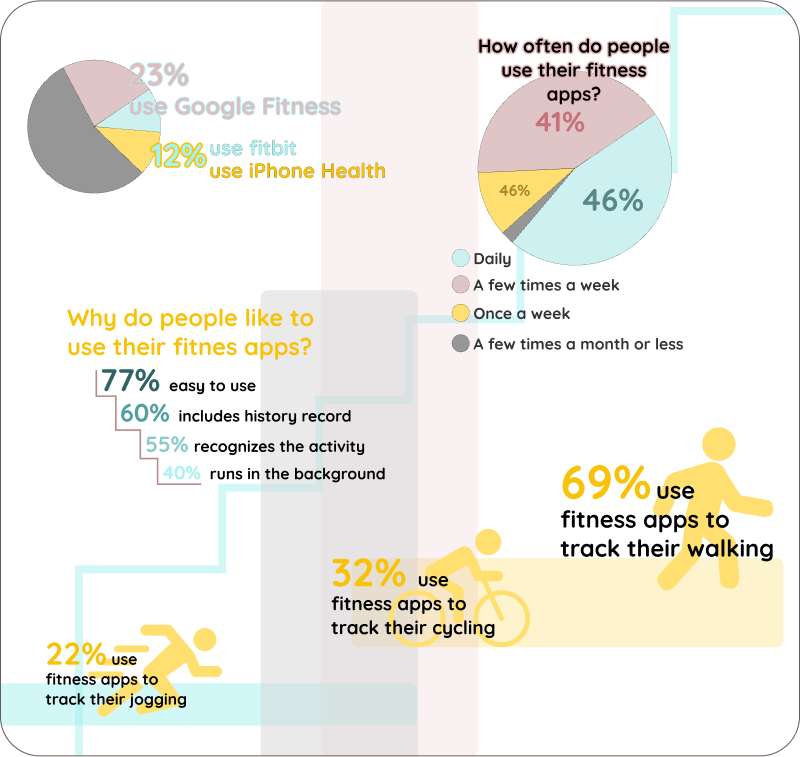
After the secondary research, we wanted more basic (and fast) data about the usage of fitness apps, e.g. the most popular apps in the market, the frequency of usage and the basic reasons for using fitness apps. So we conducted a survey and got the following results:
INTERVIEWS
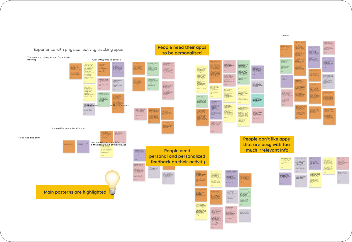
Now that we understand the behaviour of the market, we needed to dig deeper into the issues that confront fitness apps users in order to spot pain points which we can solve and use as strengths for our design. So for this, we interviewed 6 people and concentrated the insights into one affinity diagram, based on which we concluded that the main pain point is finding fitness apps not properly personalised and too busy with information that users don’t need and cannot adjust.
AFFINITY DIAGRAM
Silvia
I miss a pregnancy tracker which would enable the app to know that I’m pregnant and adapt my physical target accordingly. I also wished it could give me notifications or messages not to be too difficult on myself during pregnancy.
Adel
I would have preferred if the Oura Ring had functions of measuring blood sugar and tracking calories.
Jero
In Apple Fitness, you can set daily and monthly and yearly targets. It gives you badges when you reach your targets which is motivating.
Jamie
Google Fit motivated me because of the daily goals that I can set to myself, work towards them and keep track of progress. You can also set weekly targets, so you can do less one day but see that you made up for it.
Salma
Apple Fitness doesn’t give me advice on the weekly summary which is personalized for me.
Carin
Apple Health is not super easy to use, it’s a lot of info on just one page. There is a lot of stuff that I don’t use that is right at the top. And I cannot rearrange things.
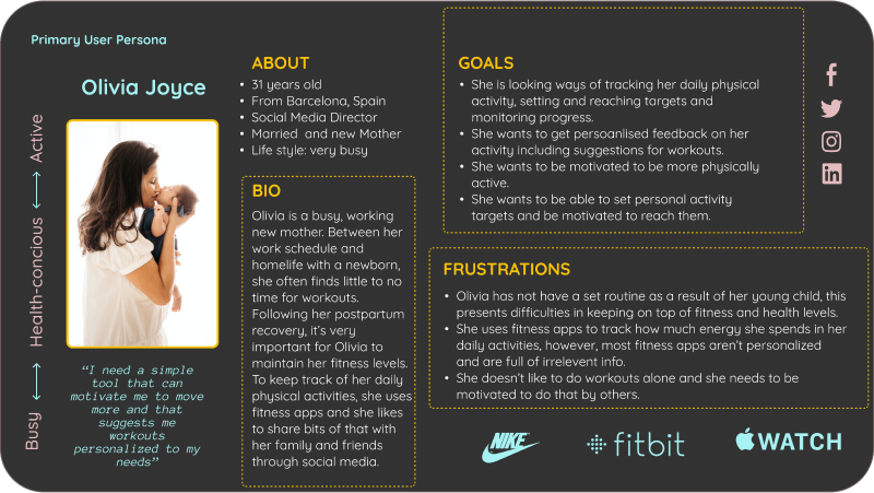
USER PERSONA
Knowing the main pain-points raised in the interviews, we started thinking about our target audience and who can be potential users of this app. We therefore created a primary user persona.
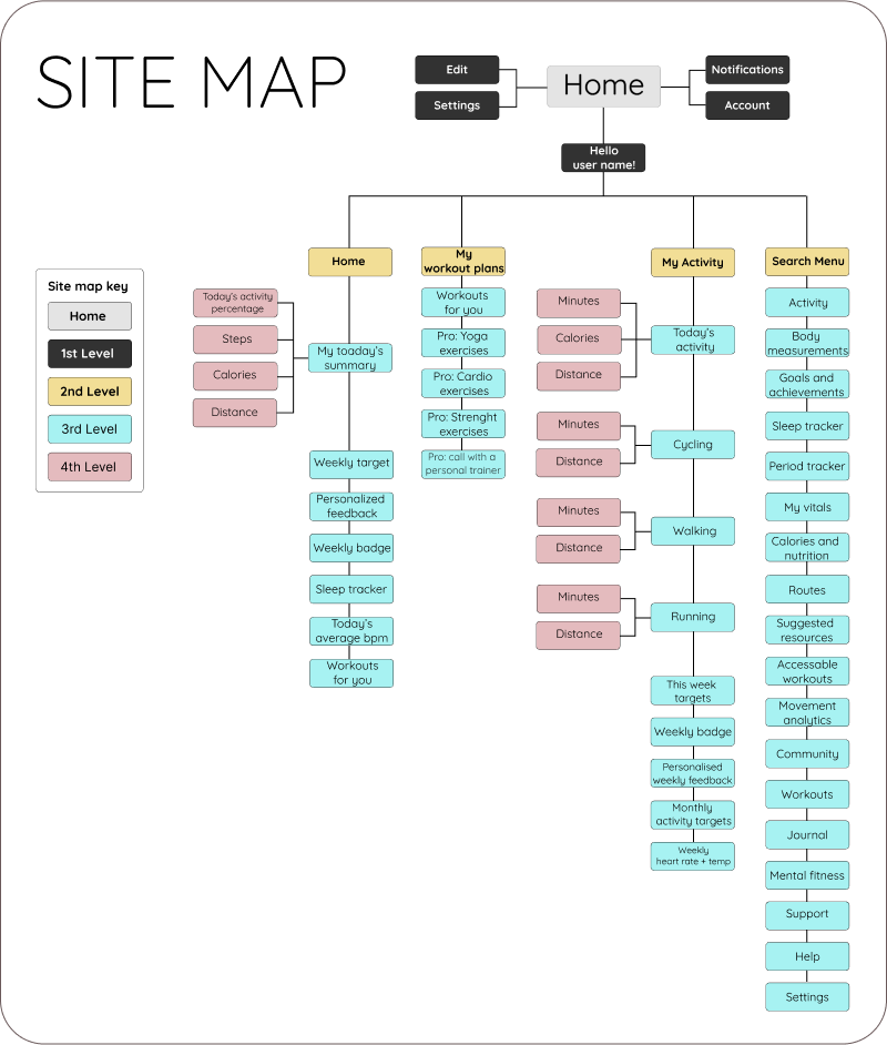
SOLUTION ARCHITECTURE
MOSCOW & MVP
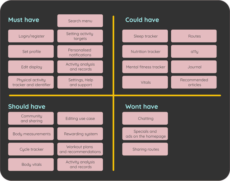
The goal of this fitness app, at the bare minimum, is to provide a way for identifying movement patterns and receive pesonalized notifications and feedback regarding physical activity. By knowing what is available, the app further aims to encourage health conscious people to reach their personal activity targets and remain motivated to do so.
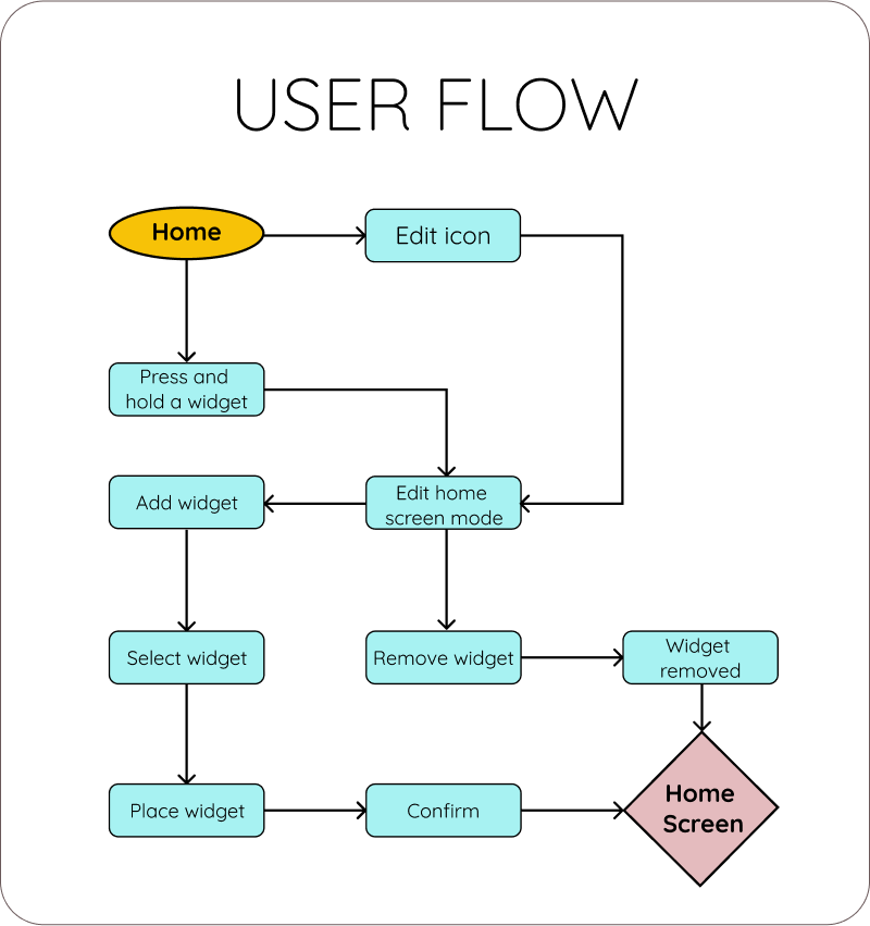
USER FLOW
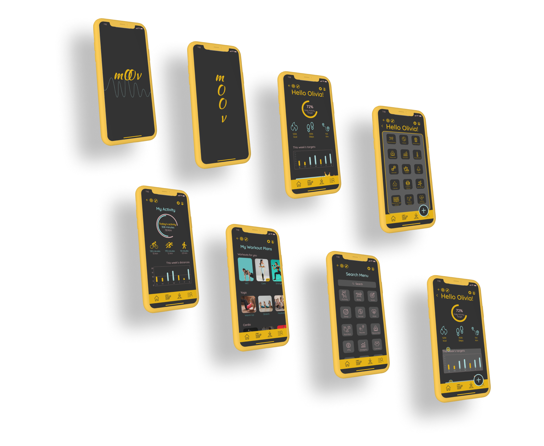
To achieve out goal we wanted to create multiple features that would allow users feel that the app is personalised to their needs including personlised notifications, suggested workouts, and two categories names 'My workout plans' and 'My activity'.
LOW-FIDELITY WIREFRAMES AND USABILITY TESTING
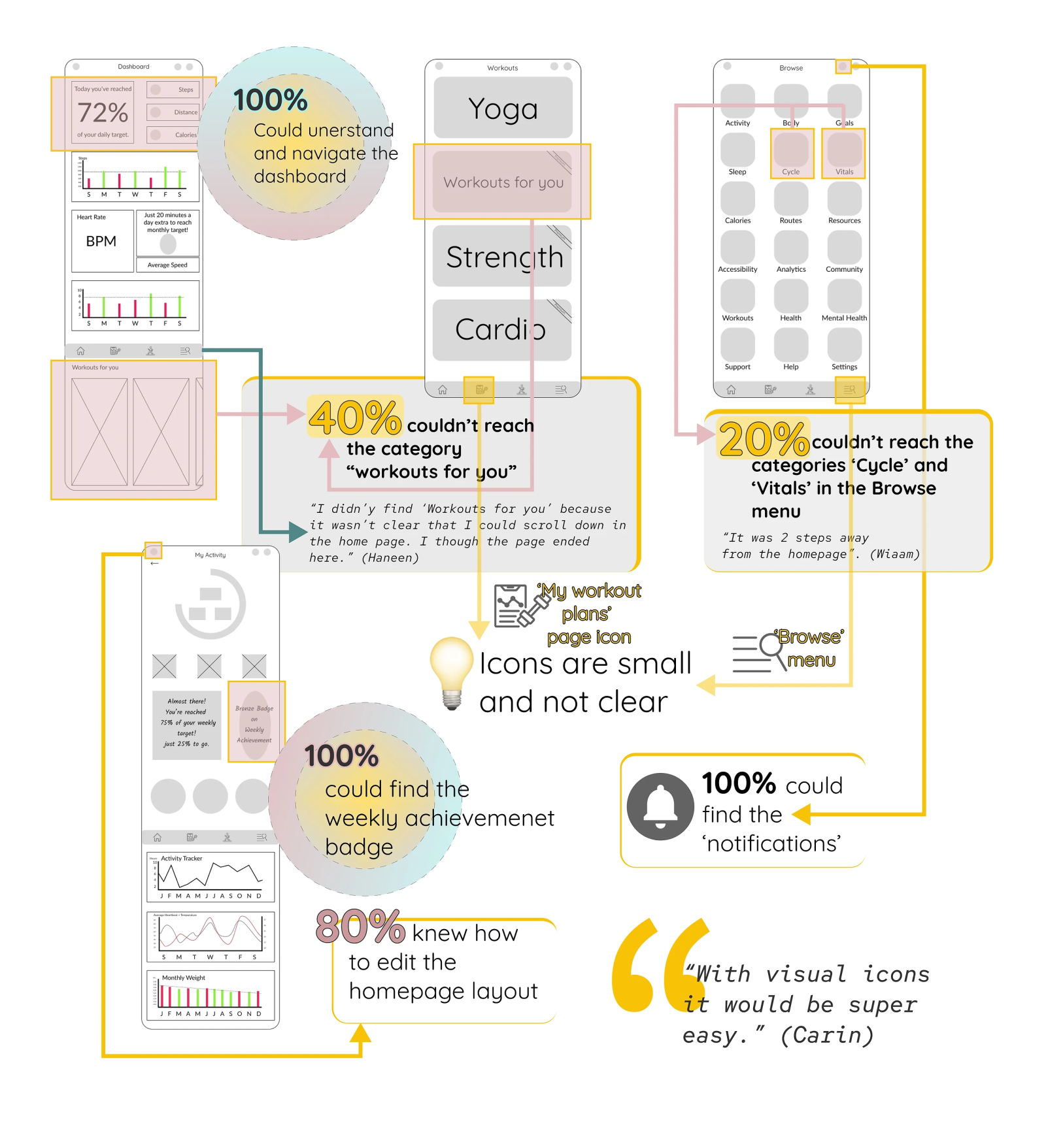
After ideating, we created low-fidelity wireframes and made a usability testing. Following are the results, based on which, we realised that we're the right direction and what we need to improve.
MID-FIDELITY PROTOTYPES
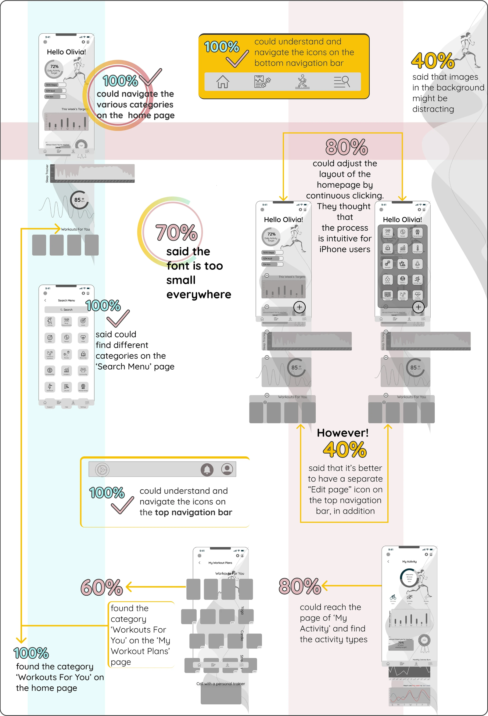
We created mid-fidelity prototype and made another usability testing.
MOODBOARD, BRAND ATTRIBUTES, DESIGN STYLE AND LOGO
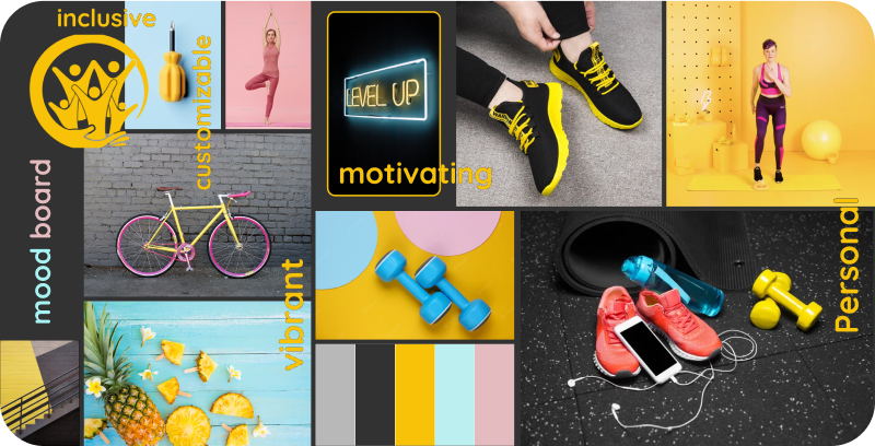
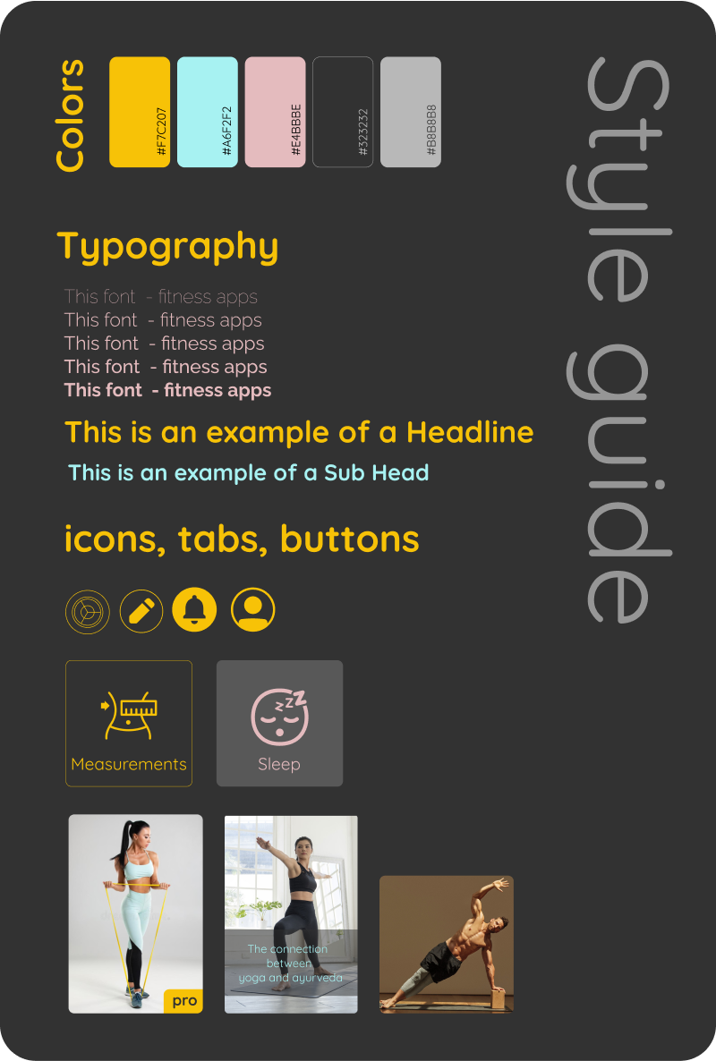
We created brand attributes based on the user research, we wanted to create a vibrant and motivating atmosphere which is simultaneously personal and customisable.
CONCLUSIONS
Jacob and I had several discussions throughout this project which, despite being challenging, brought us to good results. Based on the two usability testings conducted in the low-fidelity and mid-fidelity prototypes, we believe that we reached our preliminary goals. We received feedback from several people saying that the app is easy to use and the visuals are clear. In addition, people felt that the possibility to customise the layout and the curated content makes the app feel more personalised - which is the main problem identified in the research phase.
WHAT WE’D DO DIFFERENTLY
One of the main points we realised in a late phase is that we chose 3 primary colours (yellow, pink and blue), however, we didn’t define the hierarchy of the colours, which cost us a lot of time in later corrections. In addition, perhaps, if we had more time, we would have made a different arrangement in the information architecture.
WHAT’S NEXT
We still need to do a desirability testing on the high fidelity prototype. Also, we would have worked on more features and user flows to make the app feel mote personalised.
