Al-Markaz
Desktop website design
OVERVIEW
- The team: I worked on this project together with Gabriel and Robin.
- Role: This was a solo project of UX/UI design.
- Duration: circa 25 hours (part-time)
- Tools: Figma, Notion, Slack, Zoom, Adobe Photoshop, VEED.IO, Youtube
THE CLIENT
al-Markaz is a contemporary art gallery based in Jerusalem city and aiming to bridge between community and contemporary art through a diverse program of contemporary art exhibitions, workshops, and educational projects.
THE CHALLENGE
al-Markaz wants to have an online website that functions as an archive for its exhibitions, artists and program. How can such a digital platform be informative, accessible, and correspond with the audience needs?
Until this point, al-Markaz didn’t have a website that concentrates and documents its activity and program. Instead, its online presence has been through social media only. To design a website for al-Markaz, I worked together with Robin and Gabriel. Our main goal is to make a website that functions as a database and an informative platform about al-Markaz and its program including exhibitions, artists and events. The design needs to be both creative and functional as well as oriented towards the audience of al-Markaz including both the community and the art professionals.
RESEARSH AND PLANNING
To understand our stakeholder, we started with interviewing the artistic director of al-Markaz, Hanna Qubty. He gave us an extensive background about al-Markaz, its departments, program and mission. Following are the most important insights from this conversation:
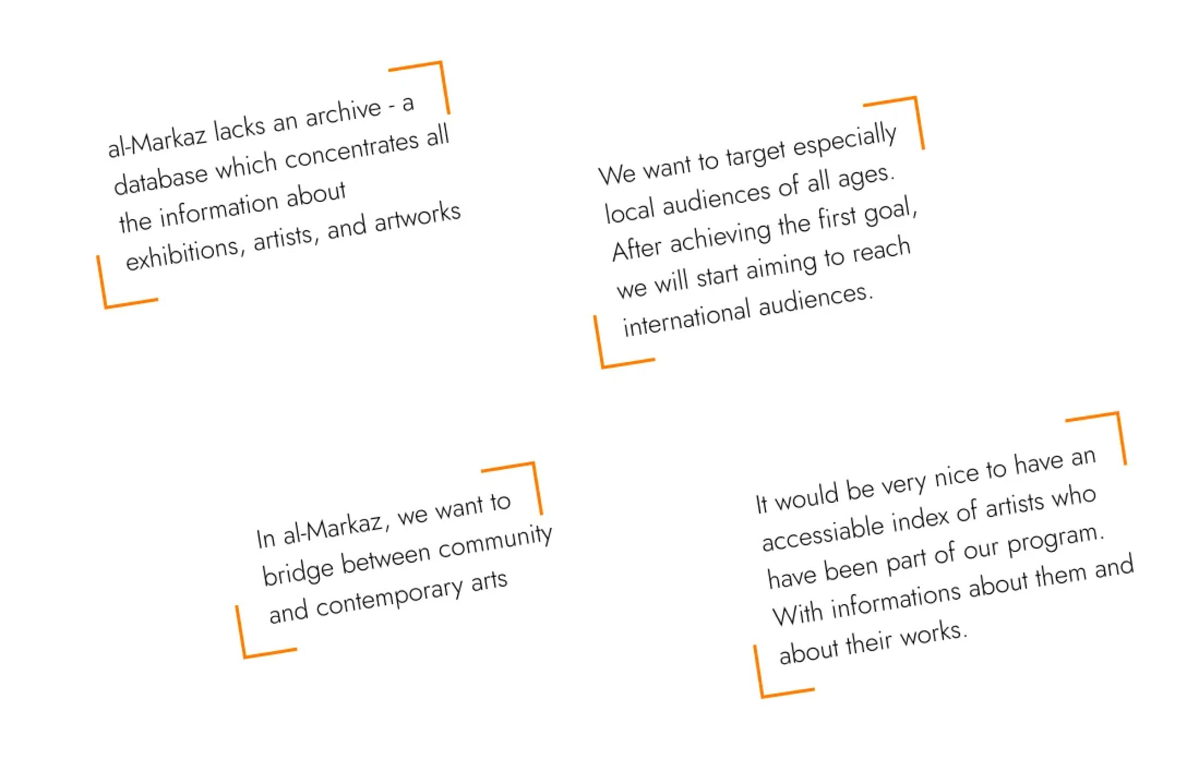
Most important insights from the interview with the artistic director on al-Markaz
Now that we know about the institution we’re designing a website for, we need to understand what people might look for in websites of art spaces. We therefore did interviews with 5 people who visit art spaces quite often, We asked them about their experiences and expectations from art spaces and their websites. After collecting the insights from the interviews in one affinity diagram, we realised that the main issue that confronts audience of contemporary art spaces is related to the lack information about the exhibitions, artworks and artists that they see.
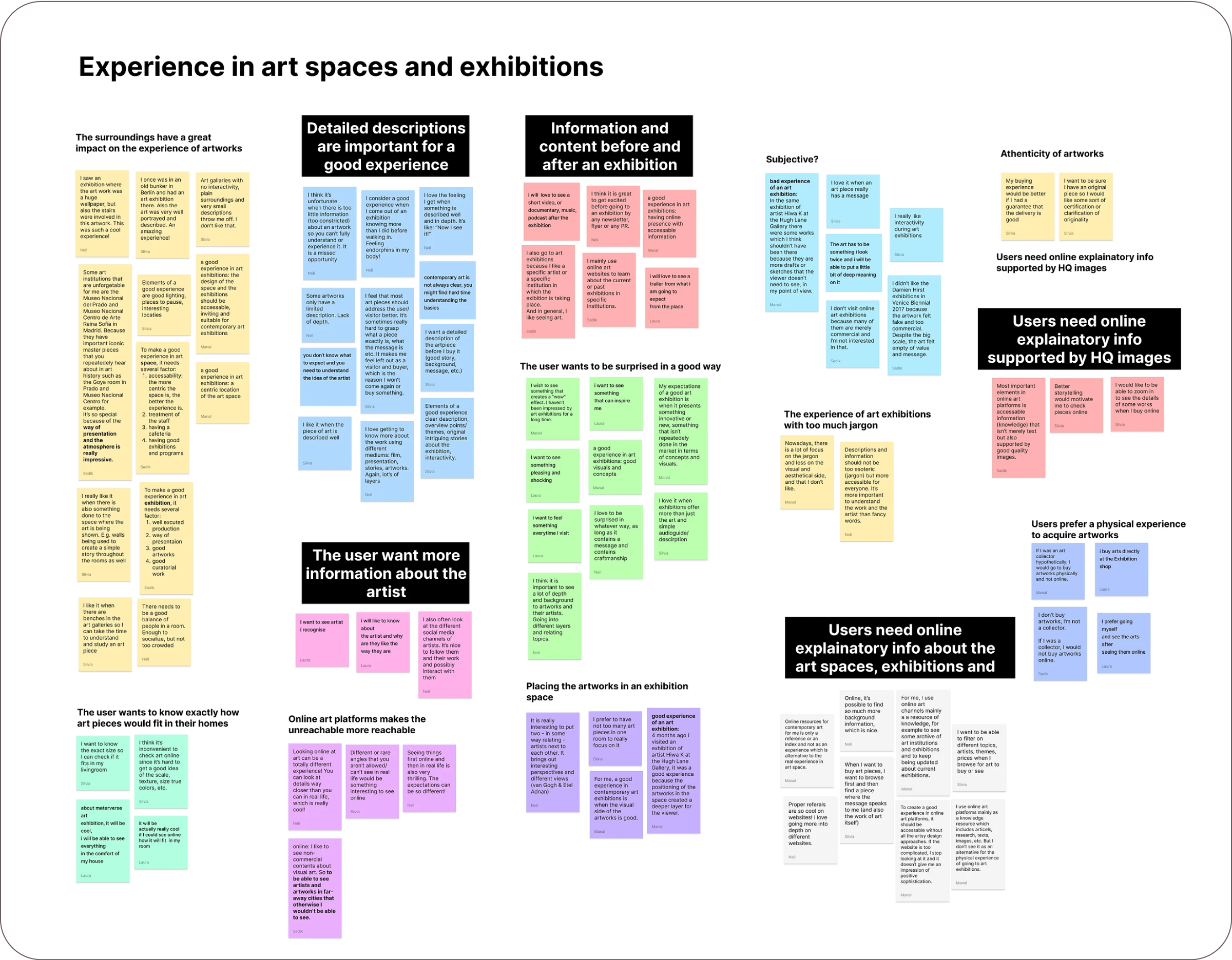
Affinity diagram with the main patterns highlighted
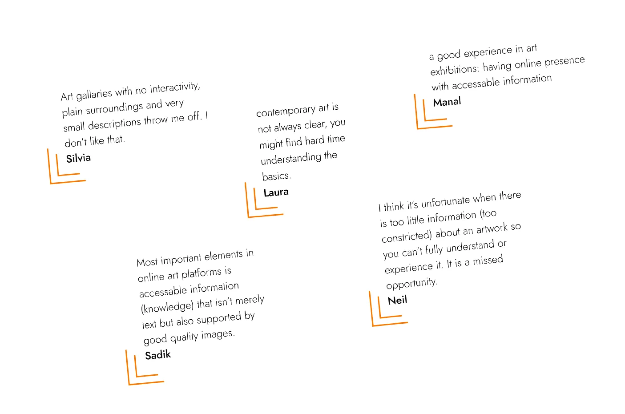
Most important insights from the interviews with people who visit art spaces often
USER PERSONA
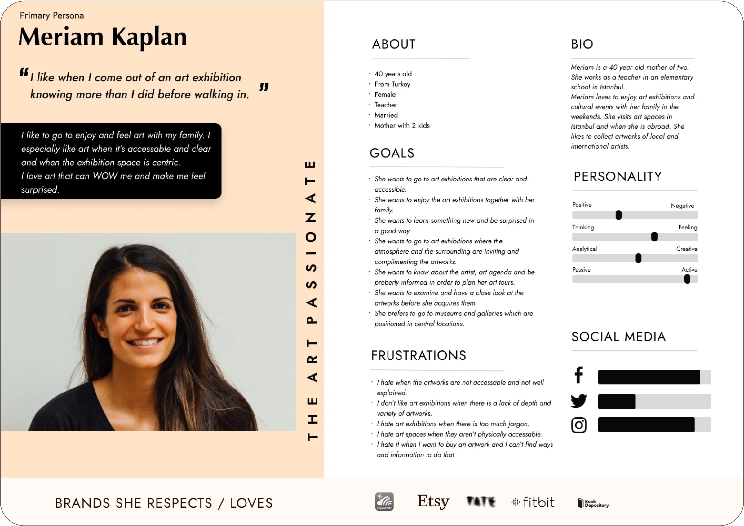
To help focus our design efforts on addressing these behaviors and pain points, we created a persona to represent the typical users of our website: Meriam Kaplan, a 40-year-old mother and art passionate, who likes to enjoy contemporary art exhibitions together with her family.
DESIGNING A SOLUTION
INFORMATION ARCHITECTURE
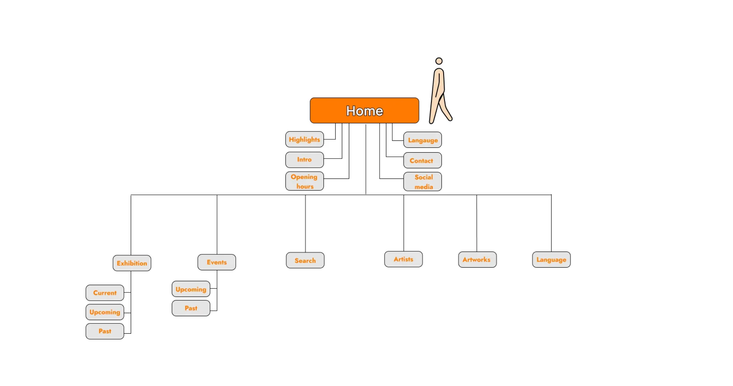
Since there is a lot of data involved, we needed to think well about how to organise all the information in a logical and clear way. During this process, we drew inspiration from similar websites of local and international art institutions including Yabous Cultural Center, Salt (Istanbul), Whitechapel Gallery and KADIST, with the goal of incorporating features that most directly addressed user wants and needs uncovered in our user research.
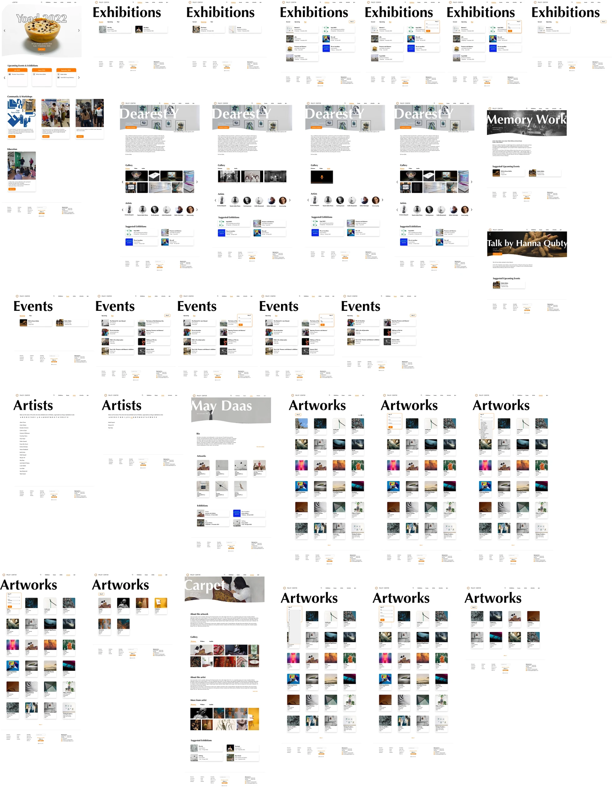
For the core of the website, we decided to include textual and visual information online about the exhibitions, artists and artworks. We included the agenda of al-Markaz including the current, upcoming, and past events and exhibitions. We also added information about the location, working hours, contact details and introduction of the place.
USER FLOW AND EARLY SKETCHES
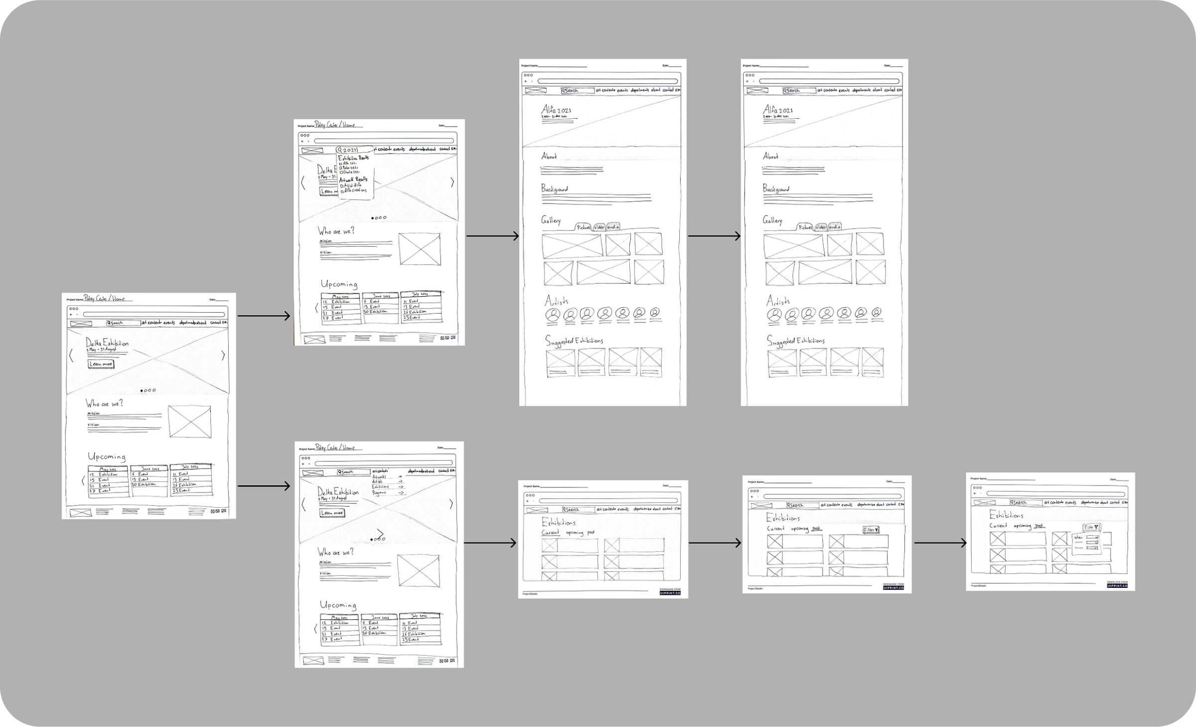
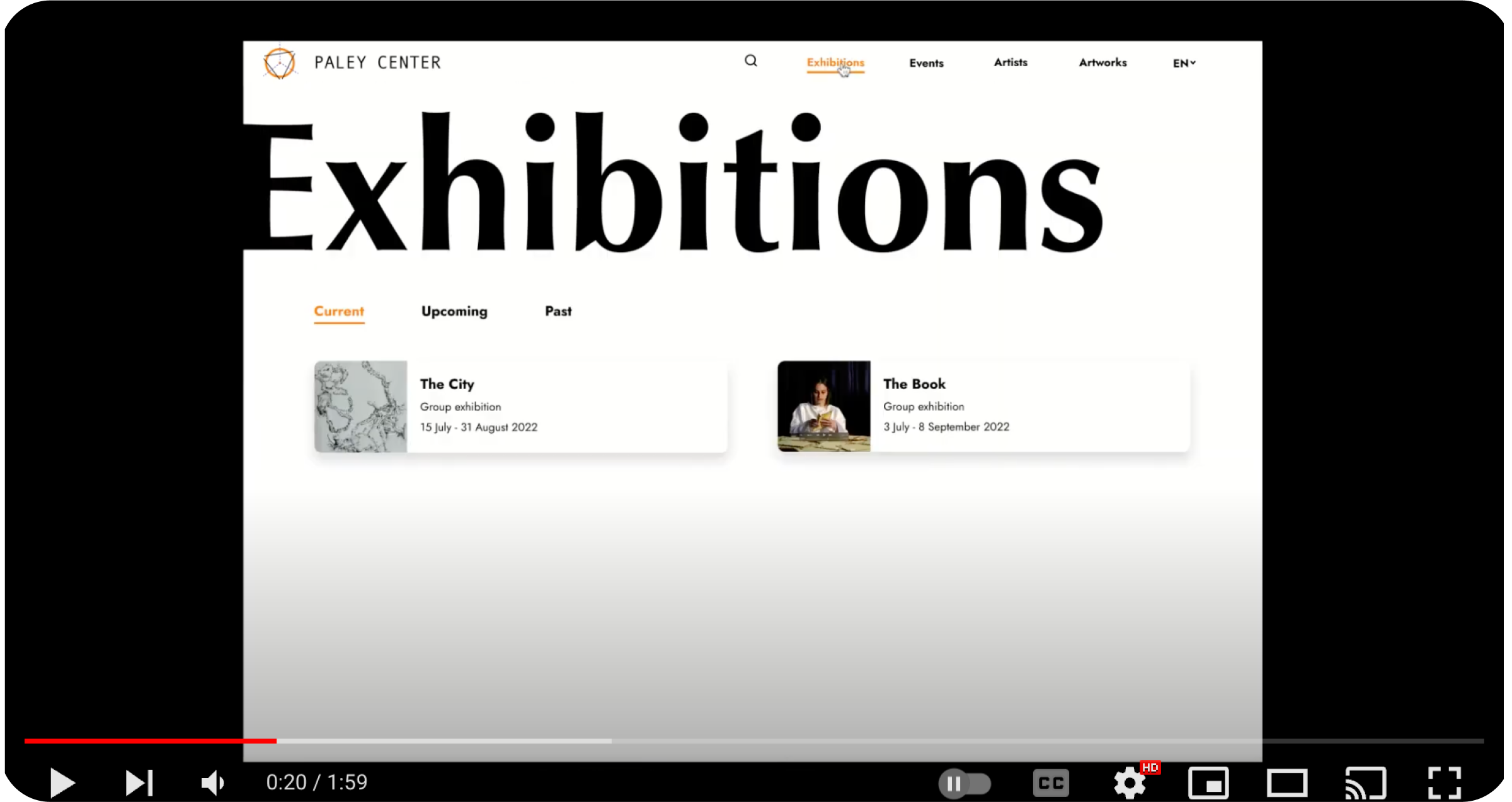
To address the goals of al-Markaz while foregrounding the experience of the audience, we needed to give users multiple ways to look information about exhibitions, events, artists, artworks. In the first draft of the user flow, we included these categories under one tab titled “art content”, however, when testing, we realized that users didnt know how to reach these categories. We therefore decided to make the process of looking up information more visible and clear by putting 4 categories on the website header: Exhibitions, Events, Artists and Artworks. In addition, we included an open search bar where users can can directly type what they’re looking for. Inside the pages Exhibitions, Events Artists, and Artworks, we added different kinds of filters to make the searching process more efficient.

MOODBOARD AND LOGO
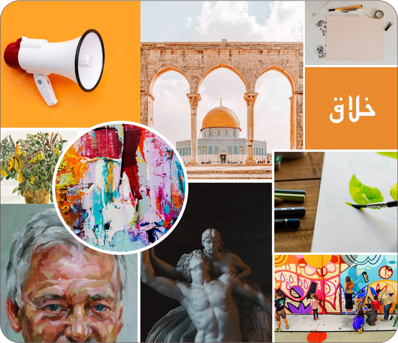
Thinking about the visual style of the website, we wanted it to tell the story of the place being located close to the old city of Jerusalem and aspiring to bridge between art and community. We were very touched by the fact that all buildings in Jerusalem are covered with the so called Jerusalem stone which contains gradients of brown, beige orange and other earthly colours. So we decided to take the most vibrant derivative colour from this stone and use it as a primary coloir for our design and that is the orange which also conveys creativity, warmth, and community.
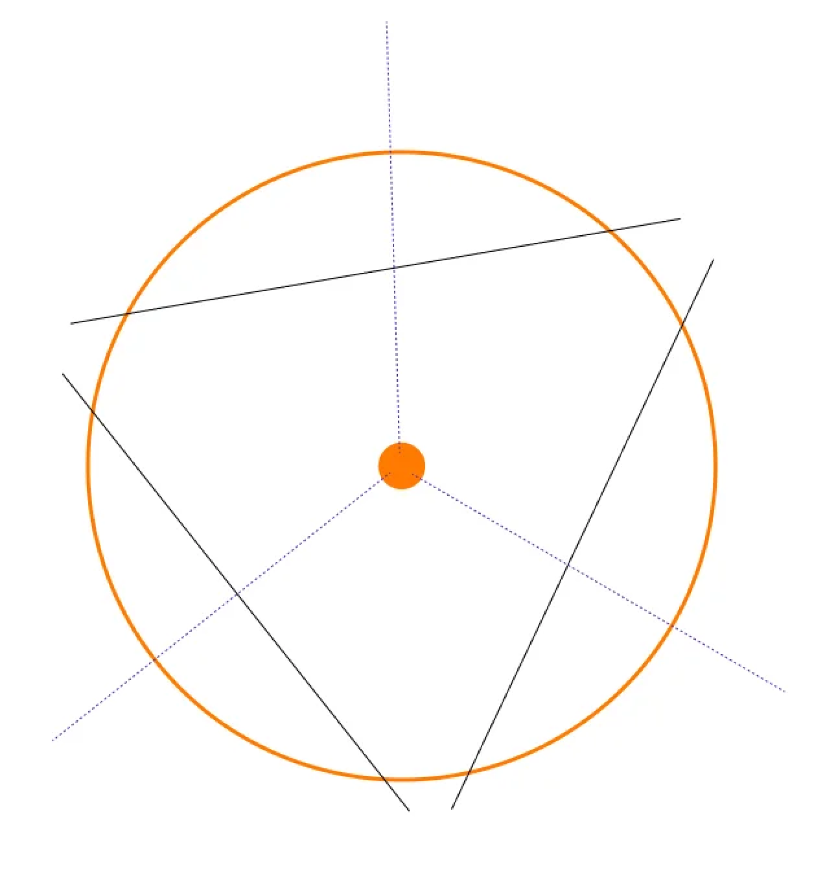
The logo we designed for Al-Markaz simulated its name and geographical position; Al-Makraz in Arabic means “the center” and it refers to the fact that it’s positioned right in the center of Jerusalem in between centric Palestinian residential neighbourhoods. The logo is formed of geometric shapes that meet in one vanishing point right in the center of a circle.
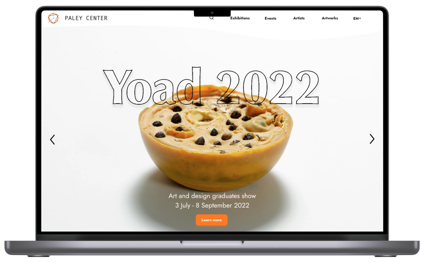
HIGH-FIDELITY PROTOTYPE
Learnings
CONCLUSIONS
We conducted a usability testing on the hi-fi prototype to see if we reached out initial goals. The tests showed that we reached out initial goals and that users could easily find information about exhibitions, artists and artworks easily which eventually made their experience in exploring the art of Al-Markaz more meaningful. In addition, some tests showed that having the agenda and upcoming events of Al-Markaz visible on the home page is inviting and makes it easy to know more about the art program. All in all, we achieved our goals and provided the visitors of Al-Markaz with a source of information and the institution with a database in which they can save their program and history.
WHAT WE’D DO DIFFERENTLY
If we were to go back in time and have the chance to do more testing, maybe we would have worked more on the information architecture and organising the data, especially in the category of “Artworks” and how it can be navigated.
WHAT’S NEXT
Since we are international team and we communicate in English, our first prototype was in English. However, out first next step is to make an Arabic version of the website because Al-Markaz main target audience are the local community of Arabic speakers in Jerusalem and Palestine. In addition, and based on insights from the interviews with both the users and the stakeholder, it would be cool to have a category on the website that enables people to acquire artworks.Furthermore, it’’s important to do usability testing with the stakeholder and perhaps design a management system through which the stakeholder can upload materials to the website.
