Amazon Prime Video
Re-Designing Android app (UI)
OVERVIEW
In this UI project, I'm proposing a re-design for the Amazon Prime Video app. I think there is a lot of (wasted) potential in this platform, and thAt it can benefit from some more user experience oriented work on re-organising its content. When I was mid way into my design process in July 2022, Amazon Prime Video launched a new major re-design which was based on extensive user experience and interface research. The new design has been getting positive reviews since then. In this article I will be explaining the steps I did towards my proposal for designing the Amazon Prime Video.
- Role: This was a solo project of UX/UI design.
- Duration: circa 25 hours (part-time)
- Tools: Figma, Notion, Slack, Zoom, Adobe Photoshop, VEED.IO, Youtube
CLONING
To understand the visual approach of the previous (or “current” by the time I started working on this) layout approach of Amazon, I started with cloning the design. I chose five screens which, I think, contain problematic issues such as the information architecture, and the visual consistency.
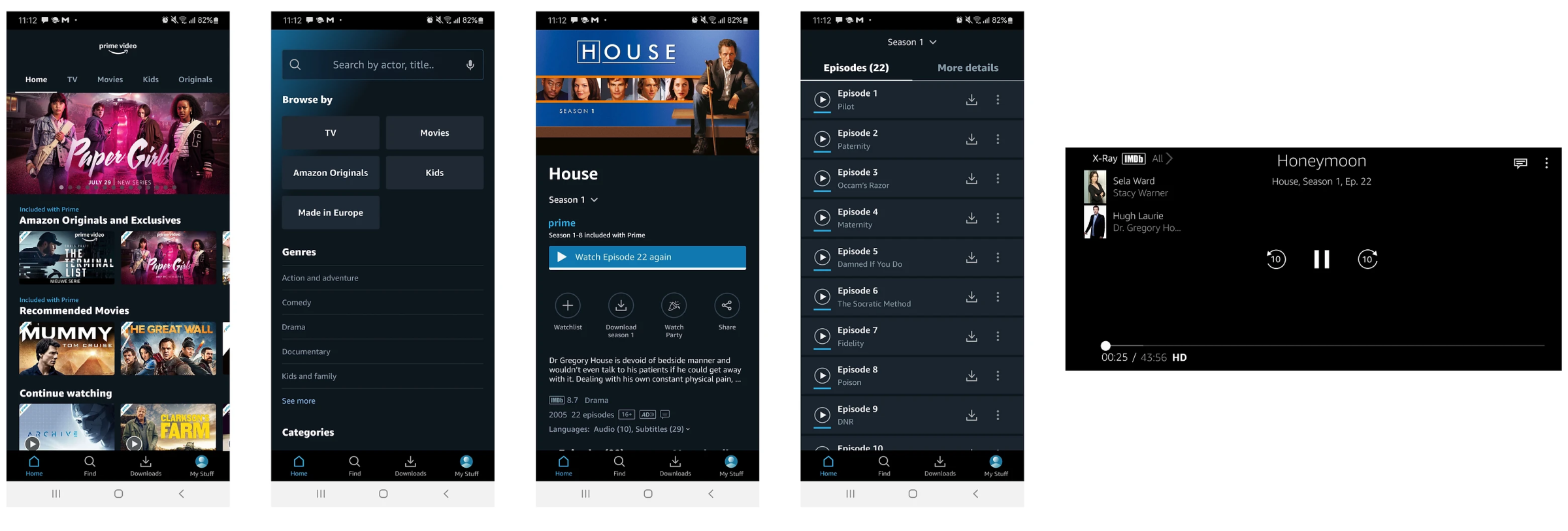
Yes! these aren’t screenshots, these are screen re-designs of the (old) Amazon Prime Video layout
SECONDARY RESEARCH
I started with a secondary research aimed at understanding the market including the strength points and weaknesses of the leading brands as well as those of Amazon Prime Video. Amazon Prime Video might be globally second to Netflix in the market of the OTT streaming services. It has huge catalog of movies and TV shows, and in attempting to compete with Netflix, Prime spends hundred of millions of dollars on production expenses for its original content.
However, until its most recent UI update last July, it actually had a lot of bad reviews on its design, some of which encouraged people not to use the platform. This derived from a number of reasons, such as the lack of visual design consistency and the chaotic information architecture (for example, seasons aren’t grouped together) amongst other reasons.
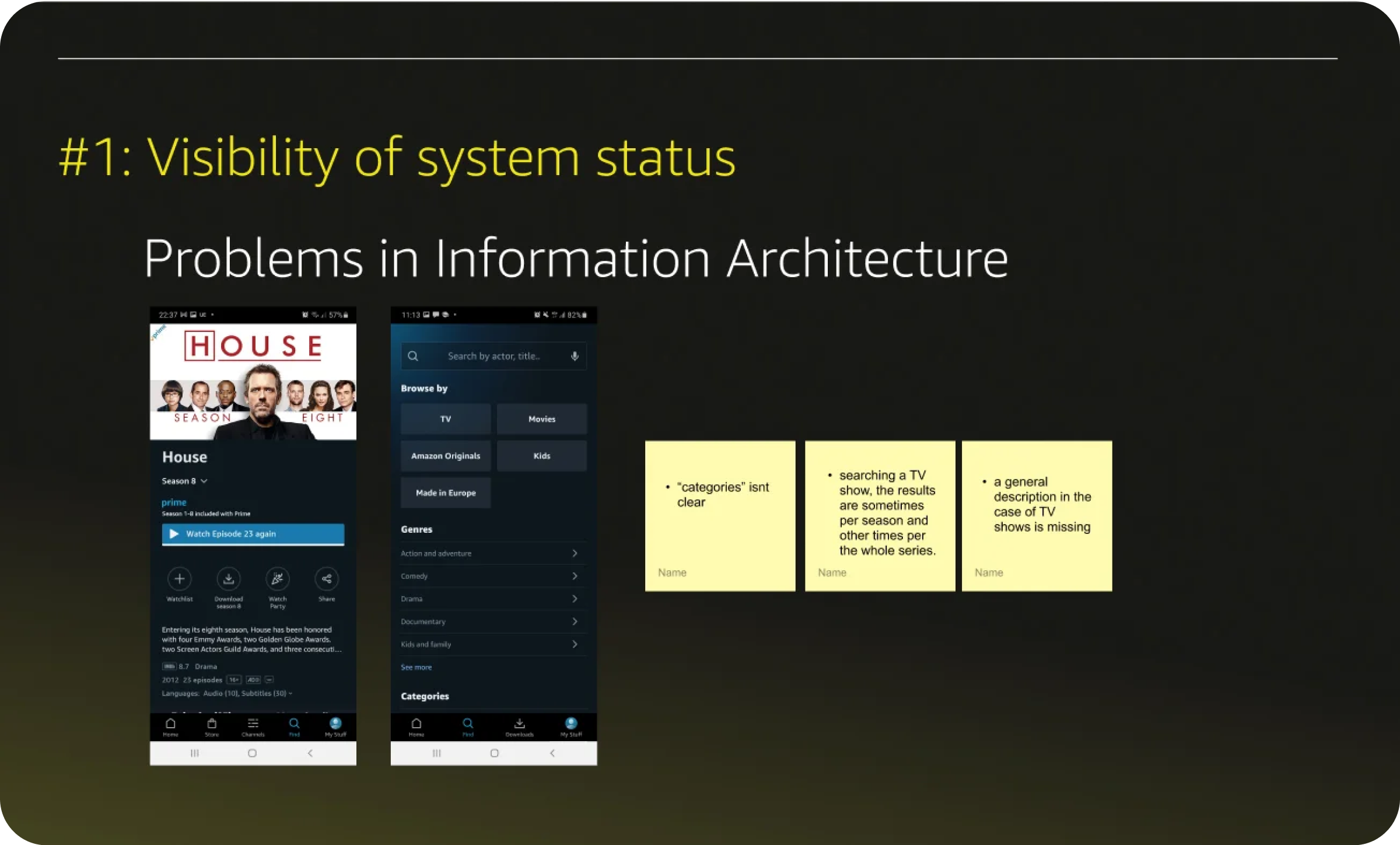
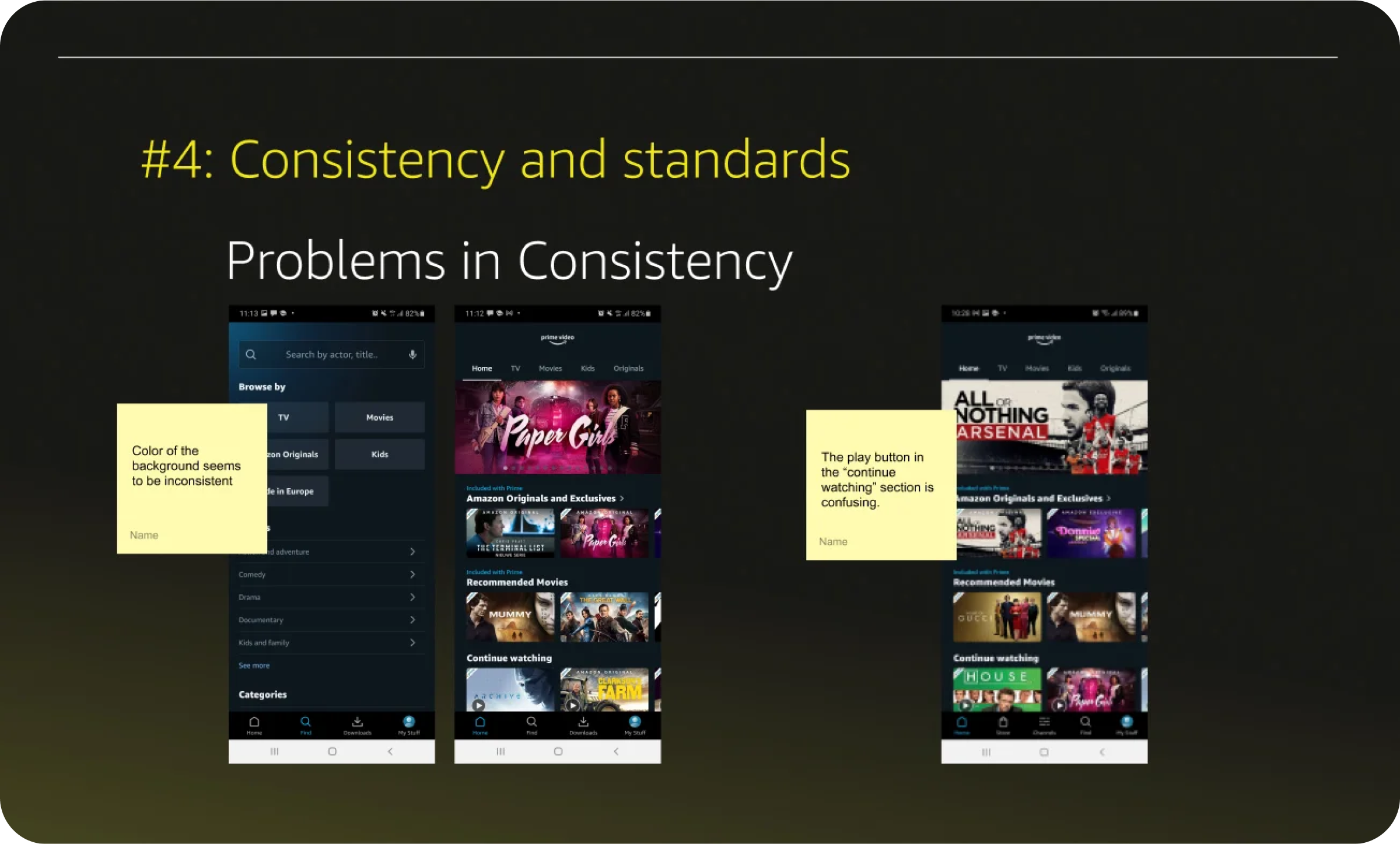
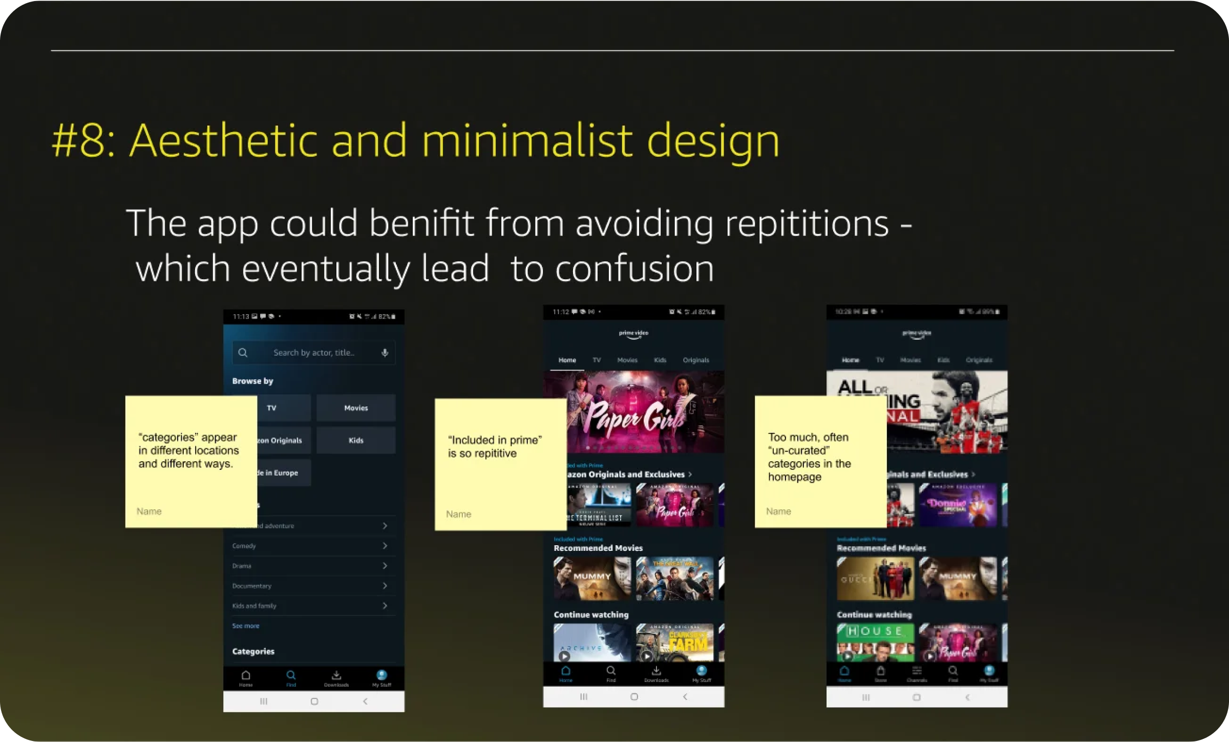
VISUAL COMPETITIVE ANALYSIS
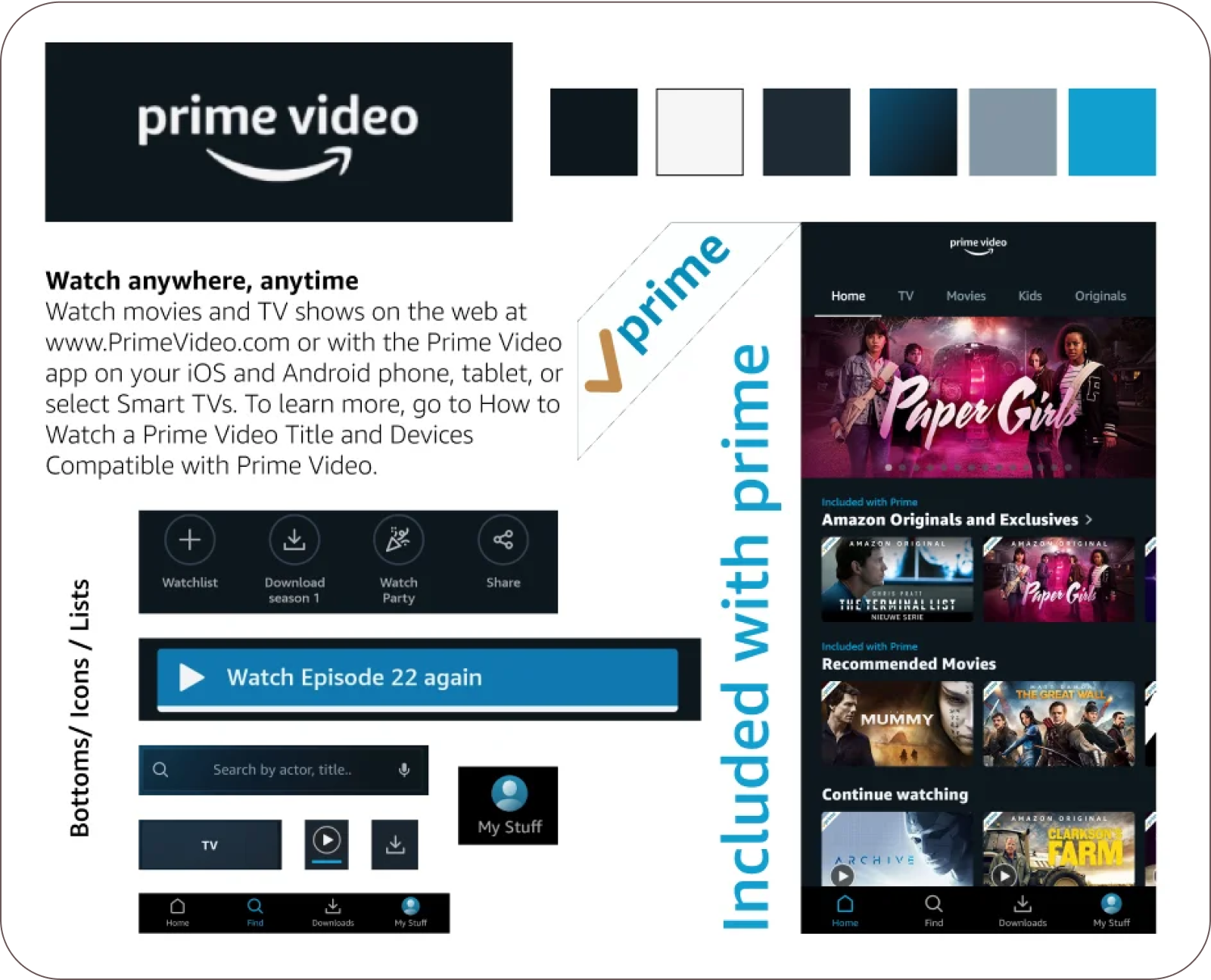
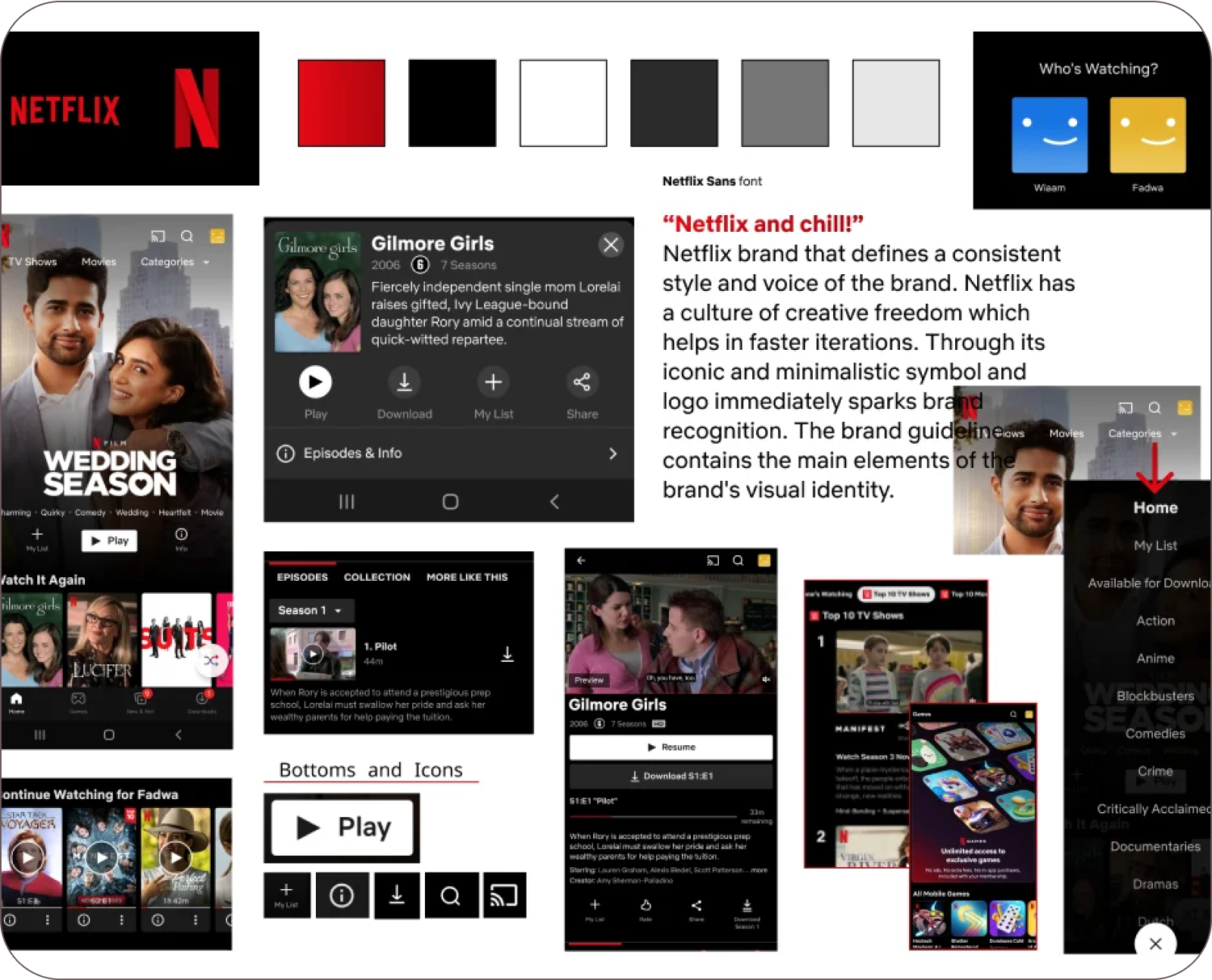
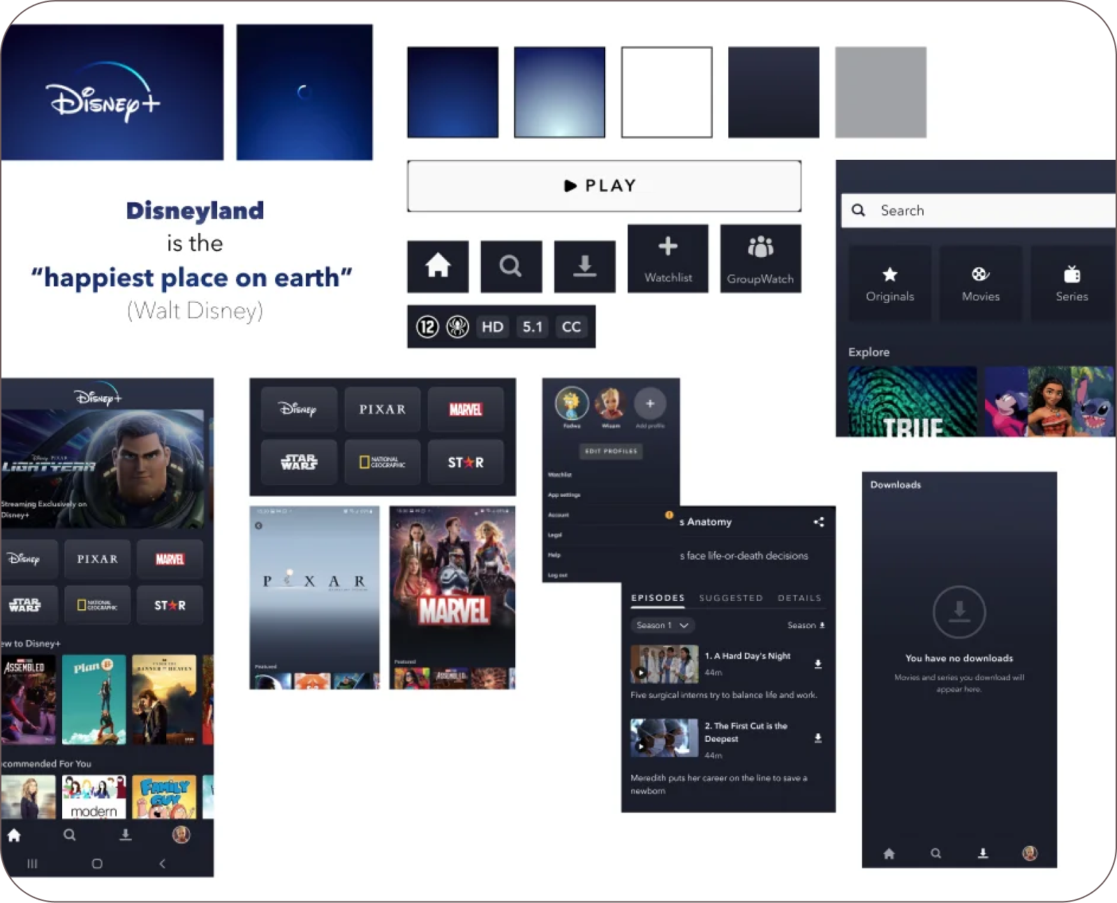
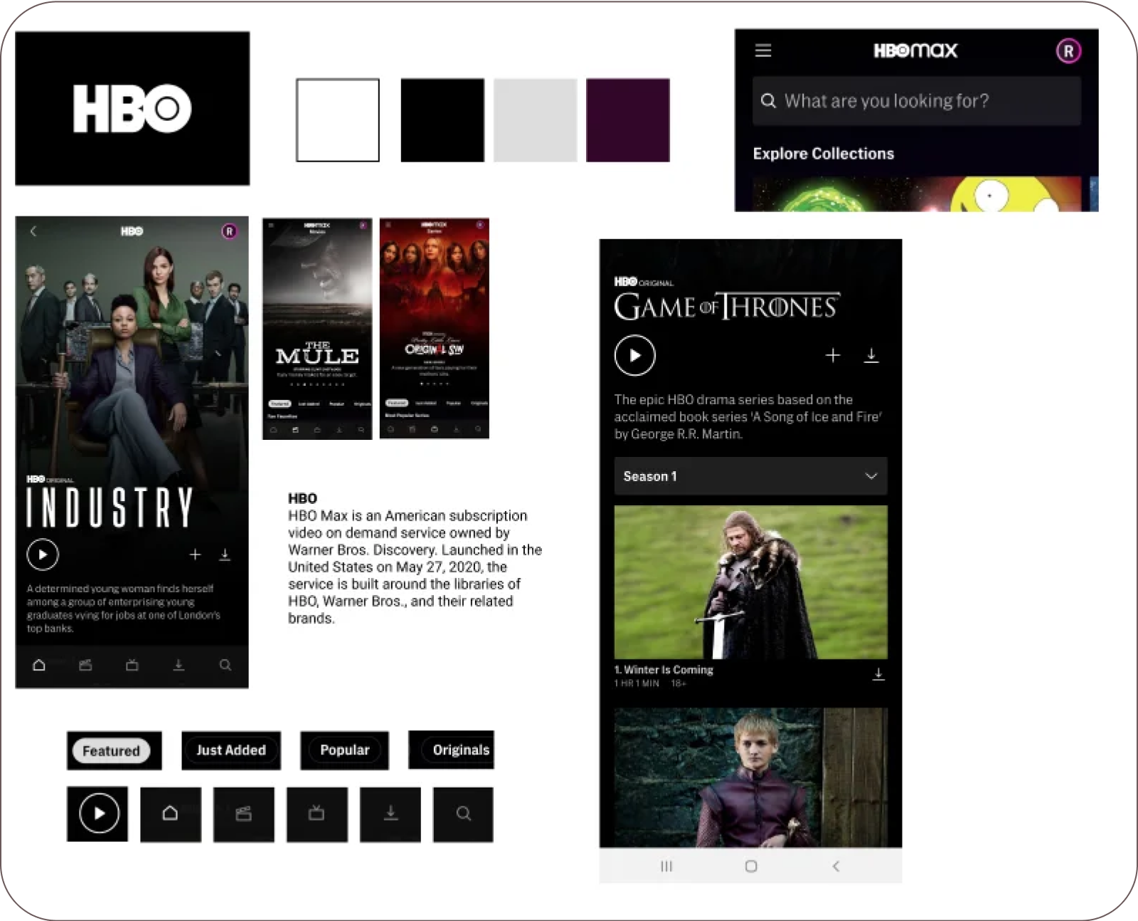
In order to understand what are the basic visual elements and the logic behind them, I started with doing a visual analysis of the Amazon Prime Video itself. Then I did visual analysis of main competitors including Netflix, Disney+ and HBO.
INFORMATION ARCHITECTURE
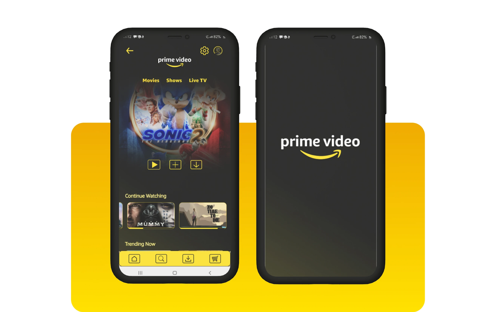
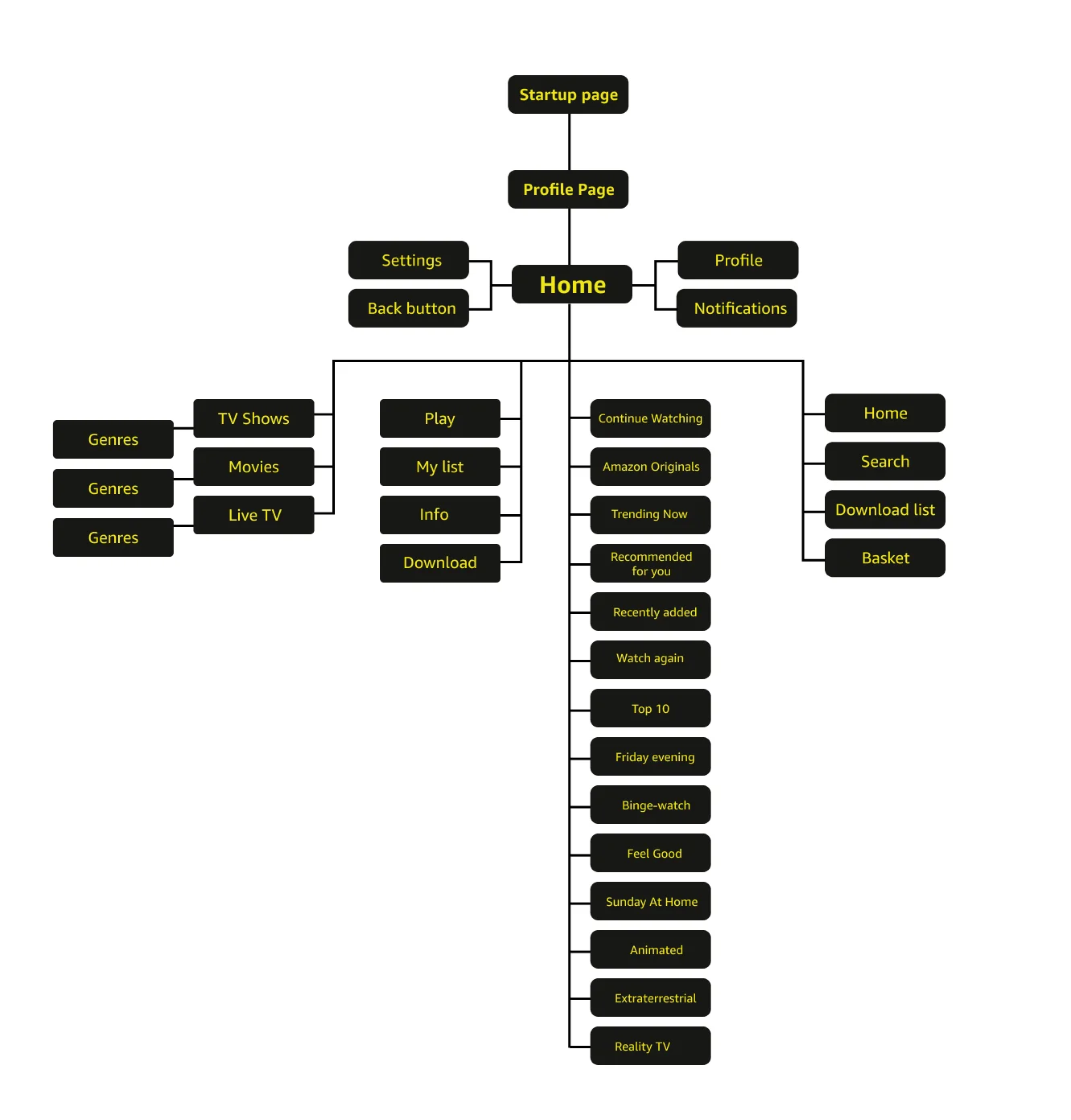
I decided to make the homepage categories “curated”; Users see categories that are relevant to them according to their usage. In addition, I placed the commonly most used categories on the top such as “Continue Watching” and “Trending Now” amongst others. I added clear icons for settings and notifications on the top navigation bar.
MOOD BOARD
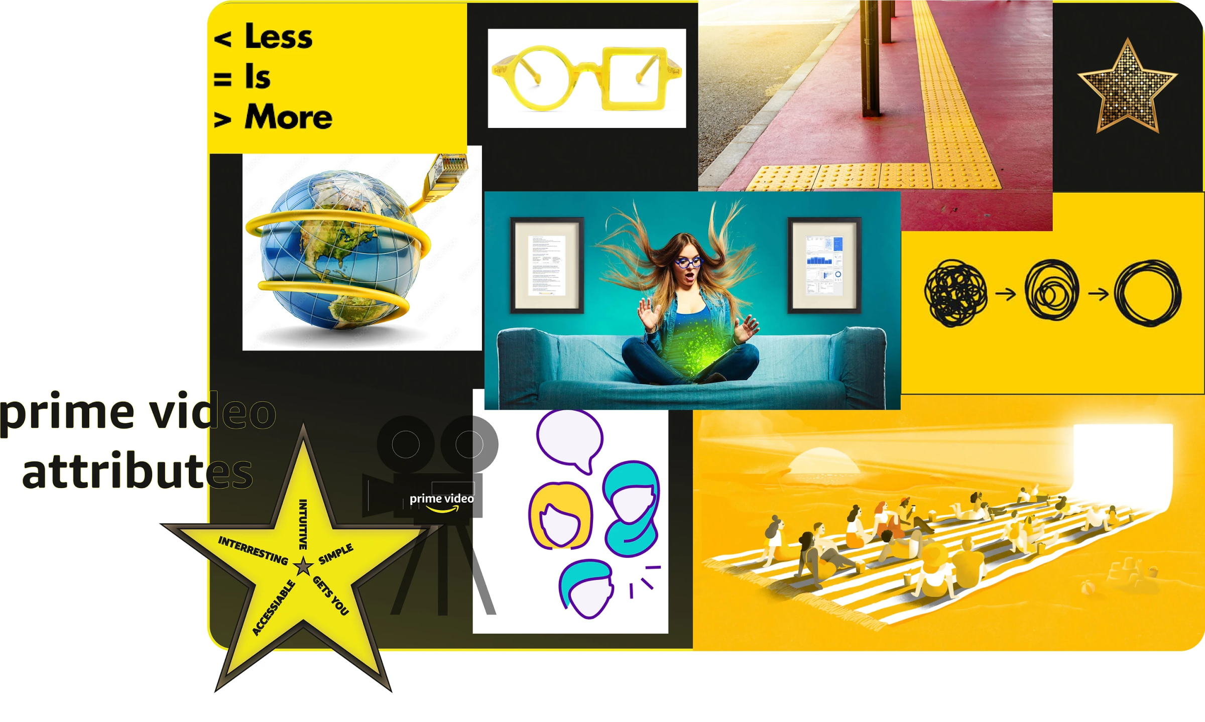
For the mood board, I wanted to give my re-design brand attributes that address the bad critique on Amazon Prime Video. The attributes include: Intuitive, Interesting, Simple, Gets You, and Accessible. Whereas one of the attributes of the old version of Amazon Prime Video was humbleness, this one turned into a weakness as it brought some production companies into doubts about collaborating with Amazon. Instead, I think that humbleness can be replaced with simplicity, accessibility and a more personal approach in design.
HIGH-FIDELITY PROTOTYPE
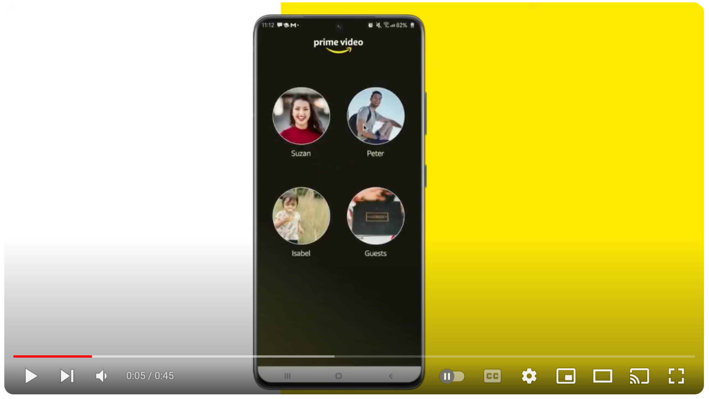
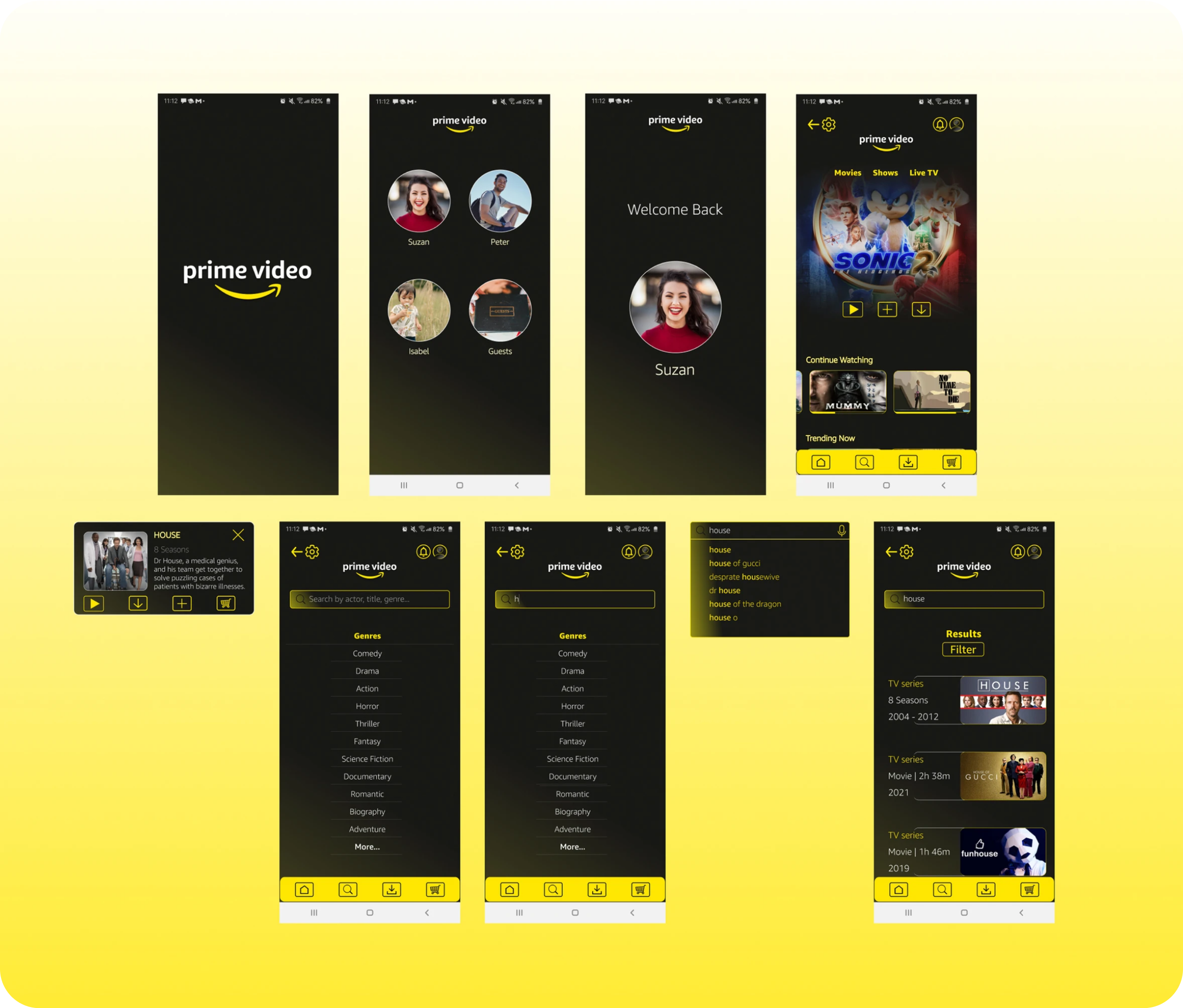
We created brand attributes based on the user research, we wanted to create a vibrant and motivating atmosphere which is simultaneously personal and customisable. In addition, we want the language and features of the app to be inclusive for its users and their health conditions.
